


Color Theory for Tila Bead Bracelets: Combos That Actually Work
What Is Color Theory and Why Does It Matter for Tila Bead Bracelets?
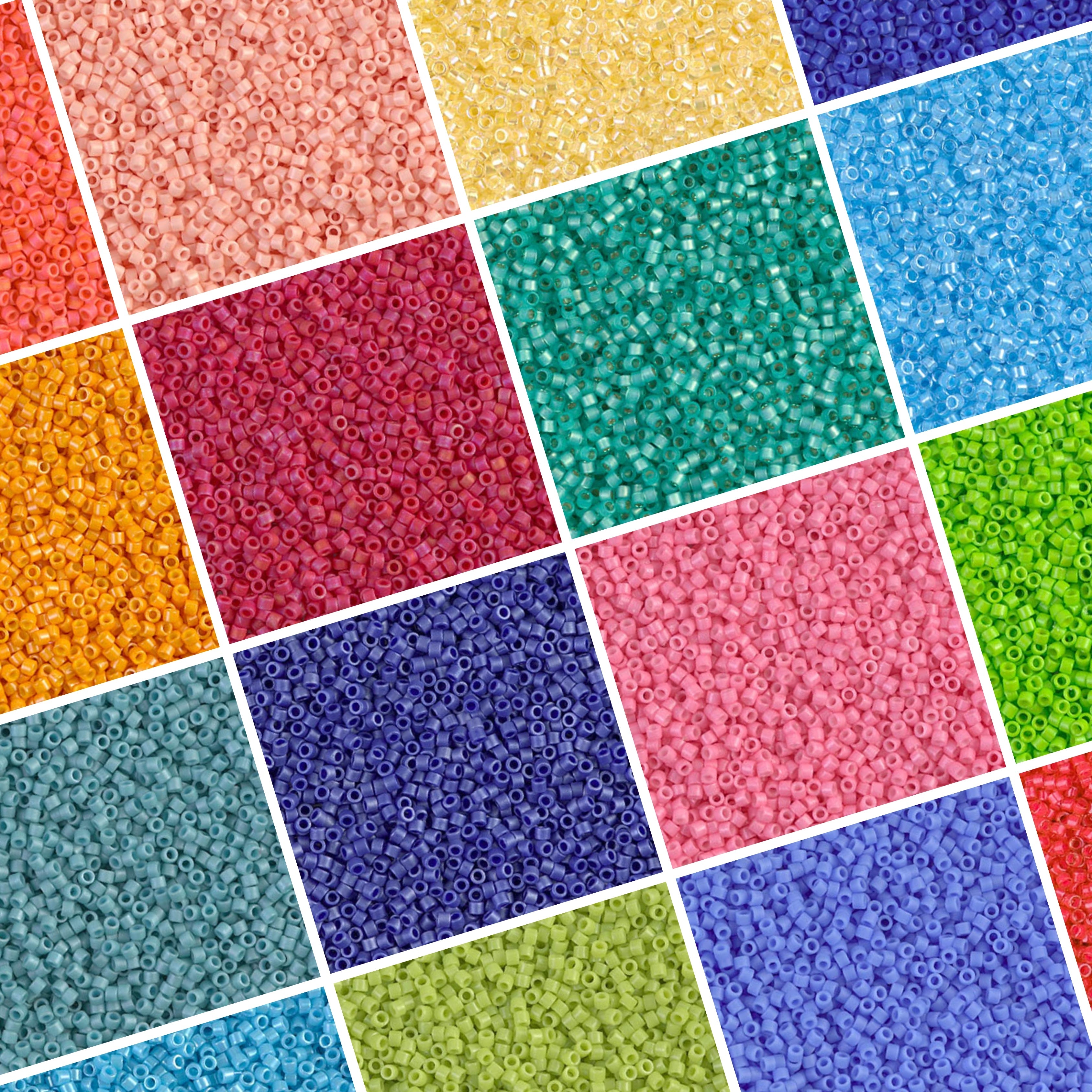
Color is the first thing anyone notices about a bracelet stack. Color theory is just a set of rules for how colors relate to each other on a wheel, whether they contrast, blend, or sit in the same family, and it's the fastest way to stop guessing and start building combos that look pulled together, not thrown together.
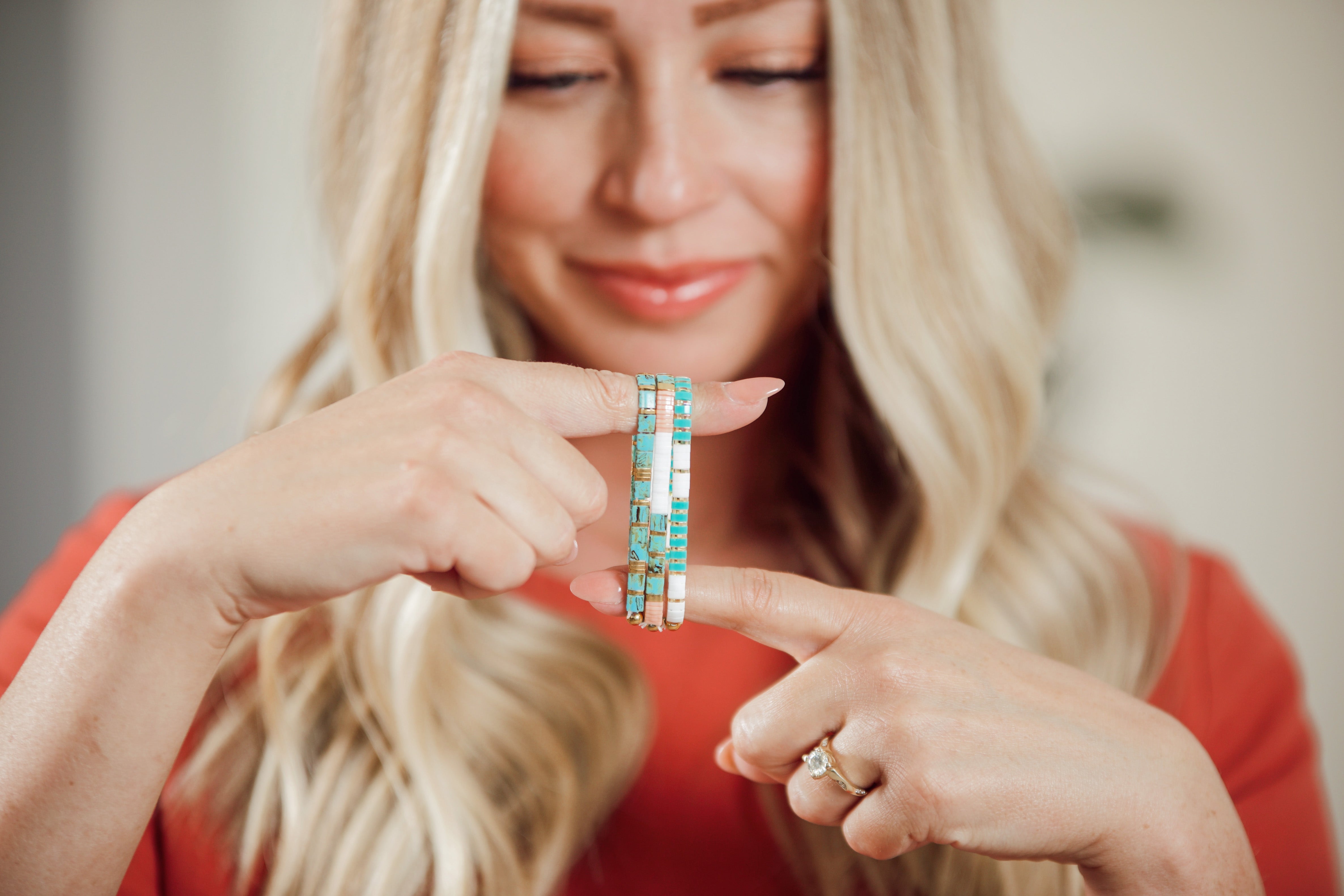
You don't need an art degree to use it. Every Tila bracelet is basically a small block of color, and a stack of three, four, or five bracelets is a mini color palette on your wrist. Once you can name why a combo works (or doesn't), picking the next one gets a lot faster.
What's the Difference Between Complementary, Analogous, and Monochrome Palettes?
These are the three basic palette structures, and nearly every good bracelet stack fits one of them. Complementary pairs colors from opposite sides of the wheel for contrast, analogous pulls neighboring colors for harmony, and monochrome stays inside one color family for a calm, cohesive look.
Complementary Combos: Go Bold or Go Home
Complementary colors sit directly across the color wheel from each other, like blue and orange, purple and yellow, or red and green. Complementary pairs create the strongest possible contrast between two hues, which is exactly why they read as bold rather than busy when you get the balance right. Let one color dominate the stack and use the other as a smaller accent bracelet or a single stripe of beads within a piece; two complementary colors in equal amounts can start to vibrate against each other in a way that's hard to wear all day.
Analogous Combos: Built-In Harmony
Analogous colors sit next to each other on the wheel, like teal, turquoise, and blue, or coral, orange, and gold. Because they're neighbors, they share an undertone, so a stack built from analogous Tila beads almost never clashes. One customer summed up exactly this effect after building her own mix: "Such a unique bead color. I paired it with plum, gunmetal gray and even fuschia." That's an analogous palette with a neutral anchor thrown in, and it's a low-risk way to build your first serious stack.
Monochrome Stacks: Quiet Confidence
Monochrome means one color family, several values. Think a pale blue, a mid blue, and a deep navy stacked together. It's the easiest palette to get right because there's nothing to clash, only light and dark doing the work. A monochrome stack also layers well under a watch or sleeve since it reads as one piece of jewelry rather than three competing ones.
How Do You Read a Color Wheel for Bead Combos?
Start with twelve colors around a circle: three primary (red, yellow, blue), three secondary (orange, green, purple), and six tertiary colors mixed between them. Color theory groups these relationships into a small number of repeatable schemes, and once you can spot them on a wheel, you can spot them in a bead tray just as fast.
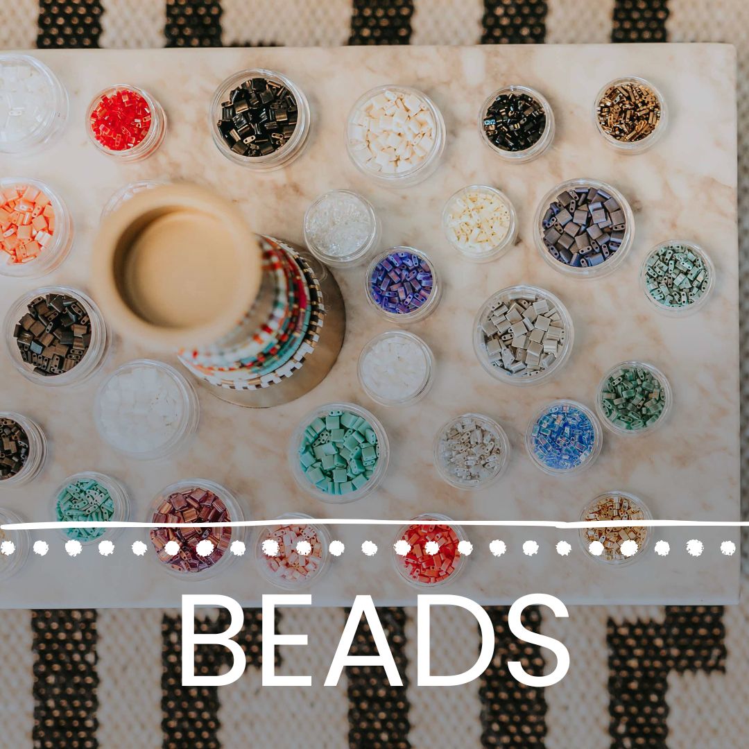
Hold two beads up and ask where they'd land on that circle. Straight across from each other, complementary. Right next to each other, analogous. Same slice, different shade, monochrome. Some beaders keep a printed color wheel next to their bead tray for exactly this reason, and it works just as well for finished bracelets as it does for loose bead mixes.
Should You Mix Warm and Cool Tones in the Same Stack?
You can, and plenty of great stacks do. Warm tones (red, orange, yellow, gold) and cool tones (blue, green, purple, silver) don't have to stay separated; the key is letting one temperature lead the stack while the other shows up in smaller doses.
A gold-heavy stack with one turquoise bracelet reads as intentional. Three warm bracelets and three cool ones split evenly can feel like two different outfits fighting for the same wrist. If you're not sure which way to lean, look at what you already wear most, gold jewelry or silver, and let that decide your dominant temperature.
How Do Neutrals Work as Anchors in a Tila Stack?
Neutrals do the quiet work nobody notices until it's missing. White, matte black, taupe, and gunmetal gray don't compete with color, so a neutral bracelet placed between two bold ones gives your eye a place to rest and lets each bold color actually read as its own thing.
This is basic color relationship logic, not a Mack & Rex trick. Neutral tones are a standard way to balance and ground brighter colors in a palette, and the same principle carries straight over to a bead stack. Buy one or two neutral bracelets specifically to serve as connectors, and you'll get more mileage out of every bold color you already own.
What Are Good Seasonal Palettes for Tila Bracelets?
Seasons make palette decisions easy. Mack & Rex's named collections are basically built-in case studies: STAINED leans jewel-toned and saturated, BEACHY runs cool blues and sandy neutrals, RETRO SUNSET is warm coral, pink, and gold, and EVERGREEN EDIT sits in deep greens with metallic accents for fall and winter.
One shopper picked up on this seasonal logic without even trying: "This bracelet looks pretty for winter wear. The colors match the winter sky." That's a cool, muted, monochrome-leaning palette doing exactly what winter palettes are supposed to do. Come spring, the same logic flips toward analogous pastels and warmer, brighter accents.
How Do You Match a Tila Stack to an Outfit?
Pull one color from your outfit, not five. A navy top with gold buttons only needs a stack that echoes the navy and the gold; adding six unrelated colors on top of an already-patterned outfit is how a stack starts competing with your clothes rather than finishing the look.
Neutral outfits are the easiest to build around because almost any palette works: complementary for a statement look, analogous for something quieter, monochrome if you want the bracelet to disappear into the outfit rather than stand out from it. Building a three-bracelet stack is also a good excuse to use Mack & Rex's buy 3 bracelets, get 1 free offer on finished bracelets, no code needed, since you're already buying in a group to test a palette.
Once you've settled on a direction, the fastest way to build it out is to shop by color rather than by name. Browse Mack & Rex's Tila bracelets collection to see current colorways side by side and pull together a stack that matches the logic above rather than guessing.
Frequently Asked Questions
What's the easiest color scheme for a beginner Tila bracelet stack?
Monochrome. Pick one color family, like blues or pinks, and stack a few shades from light to dark. It's nearly impossible to get wrong because every bead already belongs to the same family, so there's no clashing to worry about.
Can I mix warm and cool tones in one Tila bracelet stack?
Yes, and a lot of the best-looking stacks do exactly that. The trick is letting one temperature lead, usually two-thirds of the stack, while the other temperature shows up as an accent bead or a single bracelet in the mix.
What's a good neutral color to anchor a Tila bead bracelet stack?
Gunmetal gray, taupe, white, and matte black all work as anchors because they calm down bright or clashing beads without competing with them. A neutral bracelet placed between two bold ones lets both colors read clearly instead of fighting for attention.
How many bracelets should I stack together?
Three to five is the sweet spot for most wrists. Fewer than three can look sparse, and past five or six it gets harder to see each color story. Odd numbers also tend to look more intentional than even ones.
Are Miyuki Tila beads made by Mack & Rex?
No. Miyuki is a Japanese glass bead manufacturer, and Tila is a Miyuki trademark for its flat, two-hole tile-shaped bead. Mack & Rex sources and resells Miyuki Tila beads in finished bracelets, loose mixes, and kits, but doesn't manufacture the beads itself.