

Heishi Bead Bracelet Color Combos and Stacking Ideas
What color combinations work best for heishi bead bracelets?
The best heishi bead color combos balance contrast and cohesion. For polymer clay disc beads, complementary pairs (colors opposite each other on the color wheel) pop the most, while tonal stacks feel polished and wearable every day. The disc shape is small enough that color carries most of the visual weight, so the palette matters more than it does with larger beads.
The same color theory principles that apply to design apply to a wrist stack: complementary colors create the strongest contrast; analogous colors (neighbors on the wheel) produce harmony. Here are the pairings that look best in practice:
Terracotta + cream
This earthy, warm pairing goes with everything. Terracotta heishi beads against cream or off-white discs hit a southwest-meets-boho tone without looking like a costume. Try two bracelets in terracotta, one in cream, one that blends both. The muted contrast makes the stack feel intentional without being matchy.
Sage + gold
Soft and grown-up. Sage green heishi beads with gold-toned accent discs (or a gold seed bead mixed in) read as quiet and elevated. Photographs well, and pairs easily with fall and winter wardrobes.
Coral + turquoise
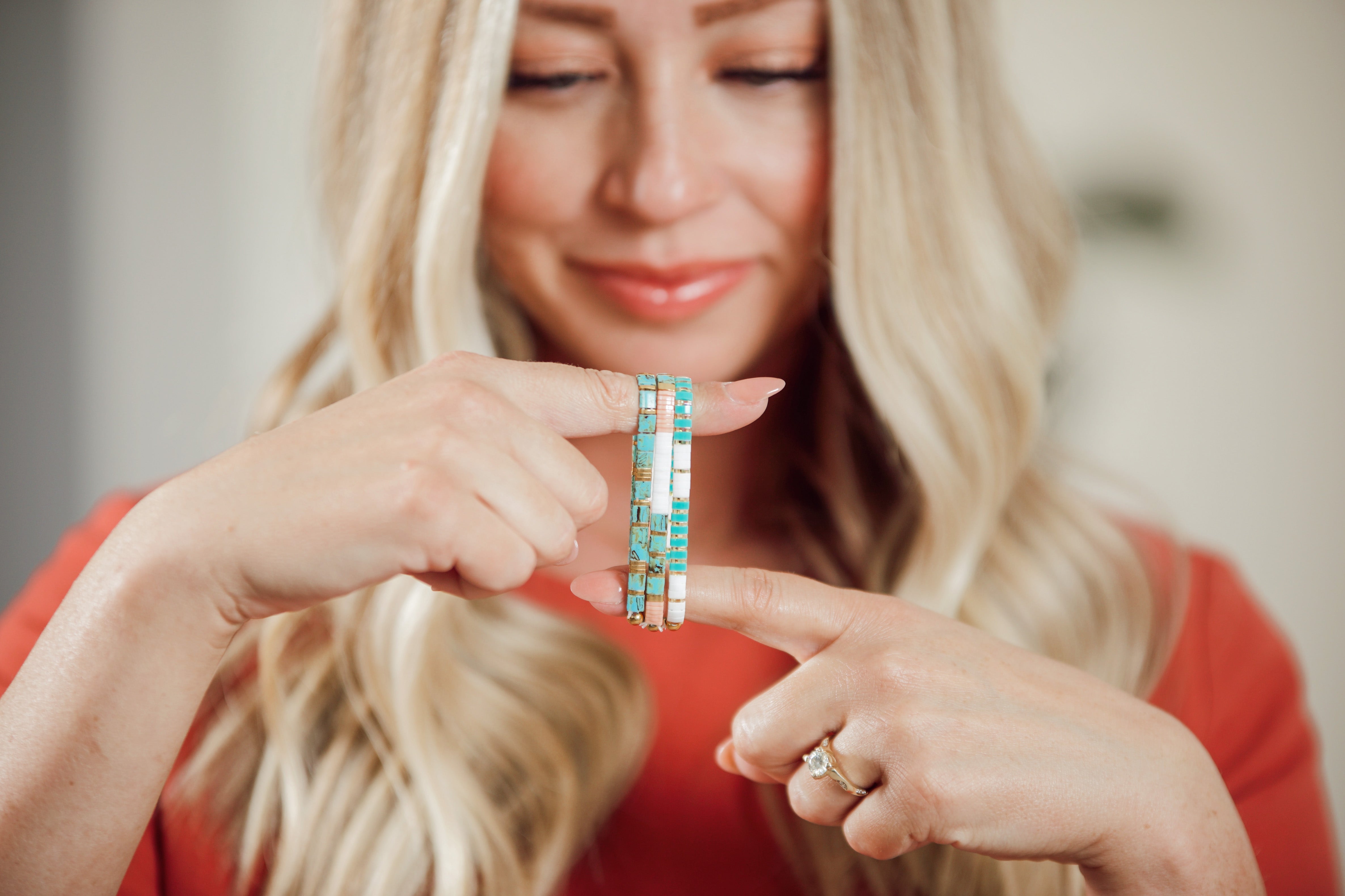
Bold summer energy. These two are complementary enough to pop, yet both read "beach vacation" rather than harsh contrast. A coral-heavy stack with a turquoise accent bracelet is the bracelet version of a bright sundress. Works best when the turquoise skews blue-green rather than true teal, which can pull too cool against warm coral.
How do tonal and monochrome heishi stacks work?
Monochrome stacks stay in one color family and vary only by shade. They're the easiest starting point for anyone new to stacking heishi beads, because there's no risk of a clash, and they look deliberately styled. Work from light to dark across three or four bracelets.
A tonal blue stack could run: pale sky, cornflower, slate, navy. Each bracelet reads as distinct, but the whole wrist looks unified. Same idea works with pinks (blush, mauve, dusty rose, burgundy) or earth tones (sand, caramel, cognac, chocolate).
What makes a good neutral everyday heishi stack?
Three colors max. That's the rule for a neutral everyday stack you'll reach for without thinking. White or ivory as the anchor, warm tan or natural as the mid-tone, and one dusty accent (soft blush, warm gray, or pale lavender) to keep it from looking plain. This palette works with jeans, work clothes, and anything in between.
Polymer clay disc beads hold color well and stay lightweight, so a neutral heishi stack won't look washed out even after regular wear. Add one or two gold or bronze metallic discs as spacers; it's a small detail that lifts the whole stack.
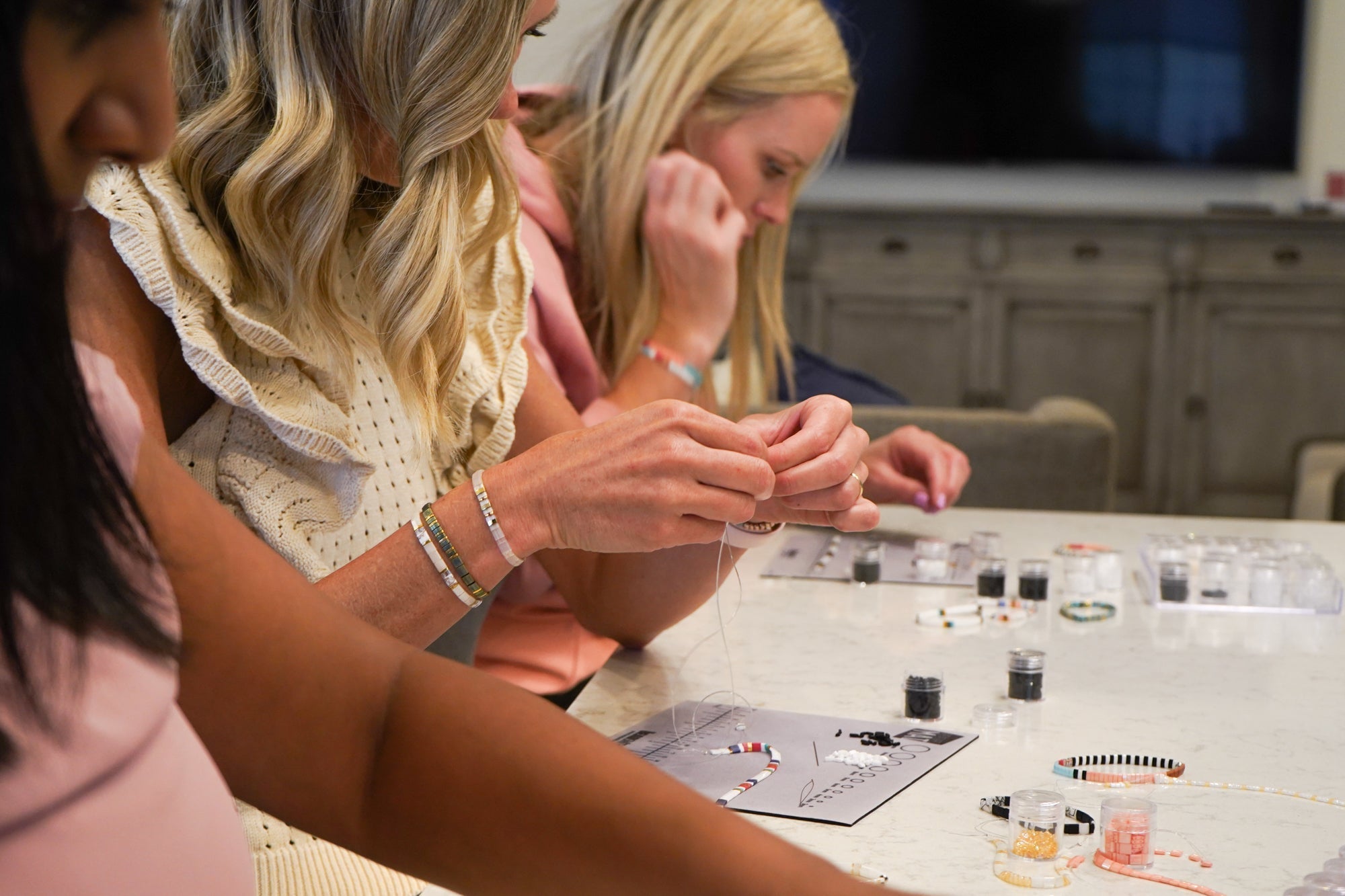
If you're making this as a family project, the neutral palette means kids can pick beads without much direction. Just keep small loose beads away from very young children, since beads are a choking hazard, and plan on adult supervision throughout.
How do summer brights work in a heishi bead stack?
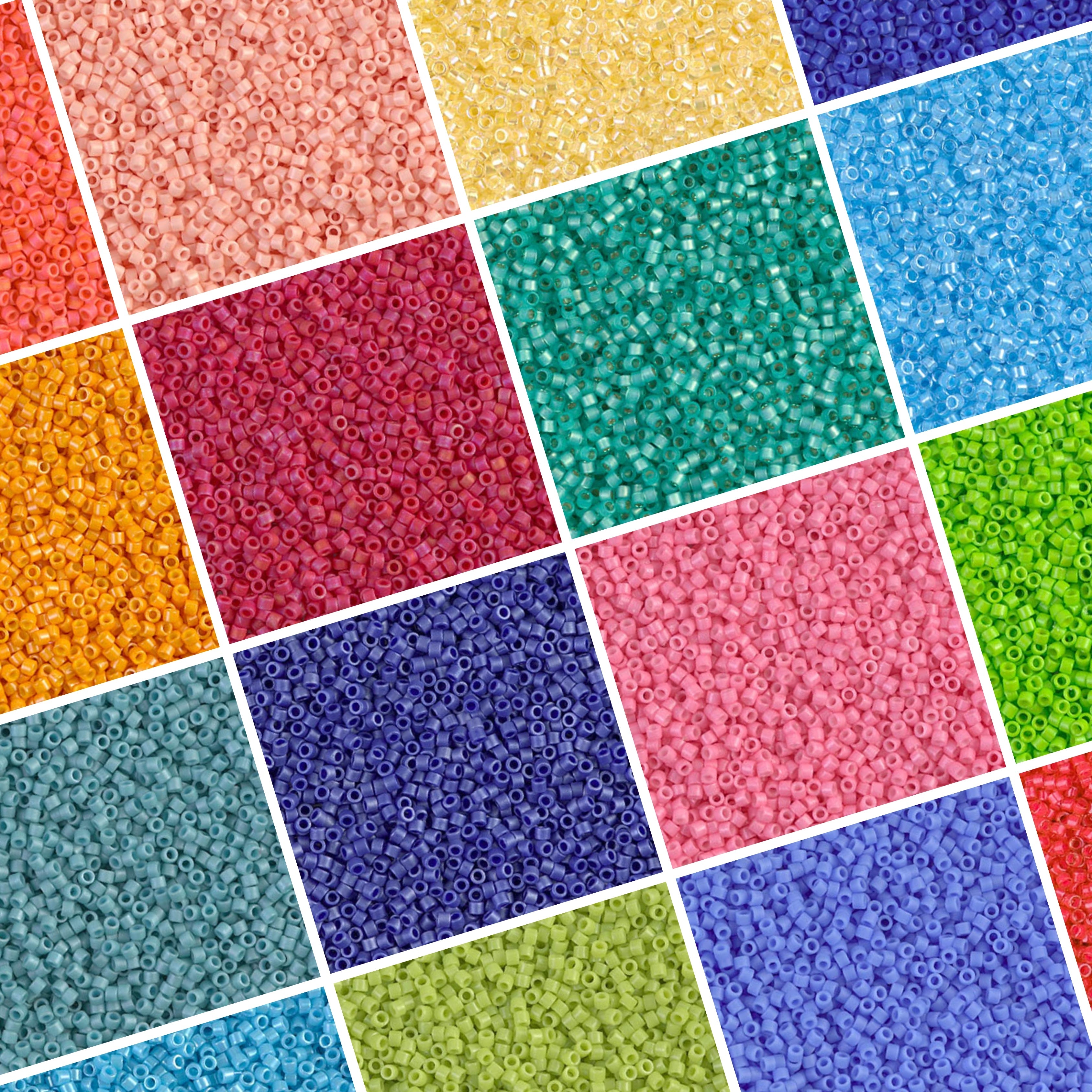
Go loud. Summer is the season to commit to color, and heishi beads in saturated brights are exactly right for it. Fuchsia, citron yellow, electric blue, fiesta orange. The small disc shape keeps even very saturated colors from feeling overwhelming.
A bright stack that works uses one dominant saturated color, one neutral to give the eye a rest, and one contrasting bright as accent. Fuchsia as the anchor, white as the neutral, a stripe of citron or tangerine as the pop. The neutral is what keeps it from looking chaotic.
One watch-out: avoid pairing two colors close on the color wheel at similar saturations. Bright orange next to bright yellow can blur together. Separate them with a neutral, or shift one to a darker value.
How do you mix heishi beads with Tila beads and seed beads in one stack?
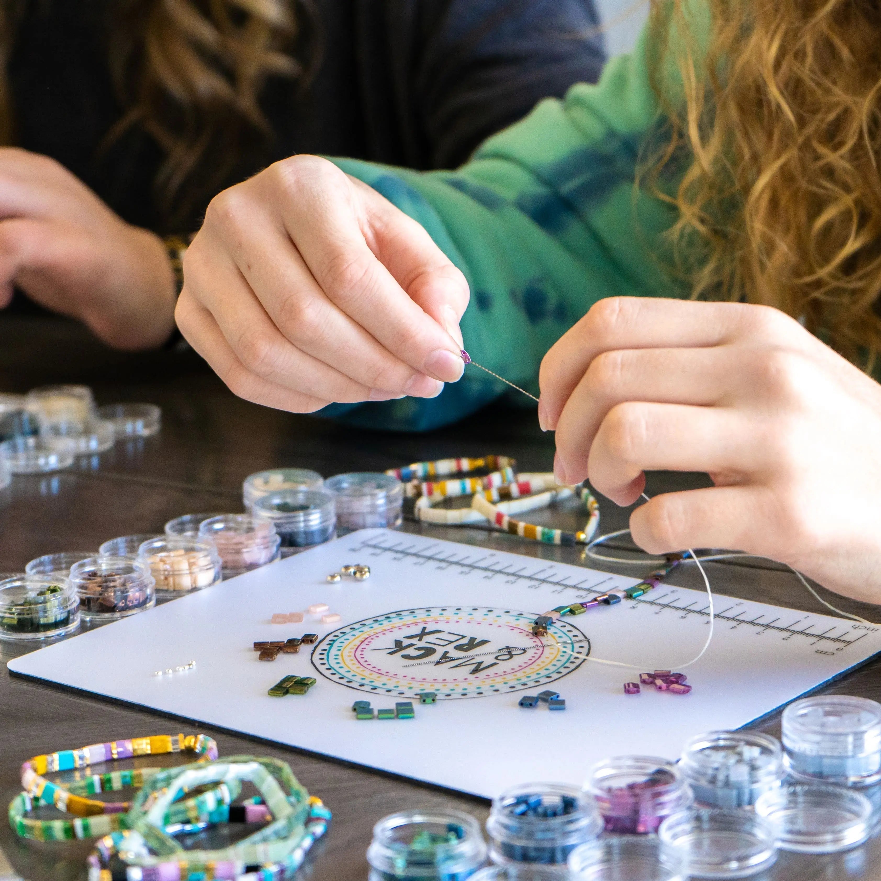
Mixing heishi beads with flat Miyuki Tila beads and seed beads is about balancing shapes as much as colors. The polymer clay heishi disc is wide and matte. The Tila bead (a two-hole flat tile bead made by Miyuki, a Japanese glass bead brand resold by Mack & Rex) is thicker and glassy. Seed beads are small and round. Together, they create height variation that makes the stack interesting up close.
The cleanest approach: anchor your stack with one or two heishi bracelets, add a Tila bead bracelet in a color that echoes one of the heishi shades (same family, not identical), and finish with a seed bead bracelet in the accent color. The Tila bracelet sits slightly higher off the wrist because of its tile shape, which creates a natural layering effect.
Keep one color constant across all three bead types. If the heishi stack uses sage green, find a Tila in deep green or a seed bead in mint. That visual echo makes a mixed-texture stack look intentional. Lima Bead's beading tips resource is a solid reference on how different bead shapes work together in jewelry design.
For a family make-together session, let kids choose the heishi colors, then layer in a Tila or seed bead bracelet as the accent. Keep loose beads away from very young children since beads are a choking hazard, and plan on adult supervision.
How do you balance colors across 3-4 bracelets in a stack?
Use the 60-30-10 rule. Sixty percent of your visual space goes to a dominant color or neutral, thirty percent to a secondary shade, ten percent to an accent. For a four-bracelet heishi stack: two neutral or tonal bracelets, one secondary color bracelet, one bold accent.
Spread the accent color across the stack rather than grouping it in one bracelet. If your accent is coral, a few coral beads on the second bracelet plus a solid coral on the fourth ties the stack together more effectively than one piece at one end. Lighter colors closest to the hand, deeper shades moving up. Small detail, but it's what makes a stack look considered.
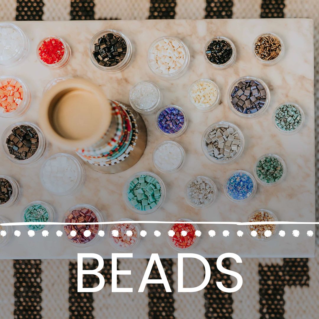
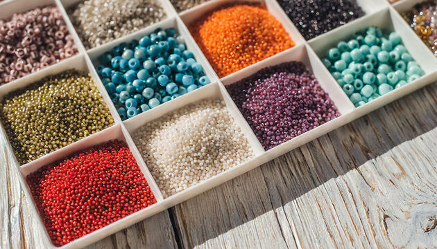
Building out a stack like this? The seed bead collection at Mack & Rex covers the color families above: neutrals, brights, and earthy tones. Miyuki Tila bead mixes pair directly with heishi for the multi-texture stacks described earlier.
Frequently asked questions about heishi bead bracelet color combos
What colors go well together in a heishi bead bracelet?
Terracotta and cream, sage and gold, and coral and turquoise consistently look great. Complementary colors (opposite on the color wheel) create the strongest contrast; analogous colors like peach, coral, and rust give a softer, cohesive feel.
How many bracelets should I stack together?
Three to four is the sweet spot for most wrists. Start with one anchor piece in your main color, add a neutral (cream, white, or natural tan), then layer in one or two accent colors. More than five tends to feel heavy.
Can I mix heishi beads with Tila beads in one stack?
Yes, and the texture contrast makes it interesting. The flat polymer clay heishi disc and the square Miyuki Tila bead (a Japanese glass tile bead) sit at different heights on the wrist, creating visual depth. Echo the same color across both types to tie the stack together.
What is the easiest heishi bead color palette for beginners?
A neutral-first palette: white, ivory, or sand as the base, one warm accent like dusty rose or caramel, and a clear or gold-toned spacer. Three colors maximum. Works with almost any outfit and doesn't require color theory knowledge.
How do I balance colors across a multi-bracelet stack?
Use the 60-30-10 rule: 60% dominant color or neutral, 30% secondary shade, 10% accent. For four bracelets: two neutrals, one secondary, one bold. Spread the accent across the stack rather than placing it all in one bracelet.
Ready to build your own stack? Browse the Mack & Rex seed bead collection for Miyuki Tila bead mixes and loose beads in the color families covered above. Tonal neutrals, summer brights, earthy pairings: it's all there to get started.