




Minimalist Tila Bead Bracelet Stacks: Neutral, Everyday Layering
What Does a Minimalist Tila Bead Bracelet Stack Actually Look Like?
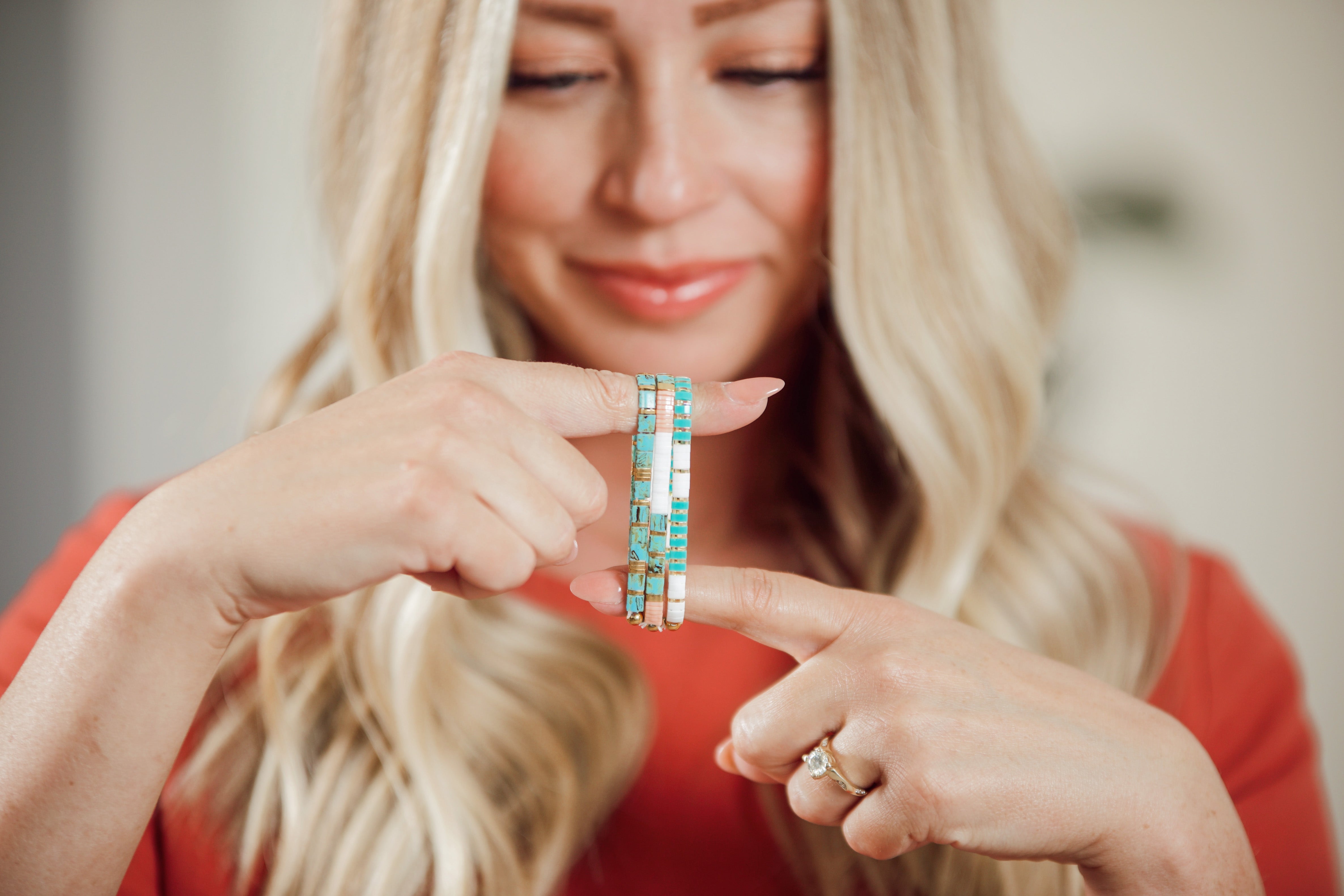
Two or three bracelets, one narrow color range, almost no visual noise. A minimalist tila bead bracelet stack trades the rainbow-mix approach for something closer to a uniform: ivory next to greige, or charcoal next to matte black, with maybe one soft metallic thrown in. The flat, square profile of Miyuki Tila beads is part of why this works. Unlike round seed beads, which catch light from every angle, Tila beads lie almost flush against the wrist and reflect light in one clean plane. That's a quieter effect by design, not an accident of styling.
This is a different exercise than a bold, colorful stack. Where a statement stack wants five or six bracelets working together, a minimalist stack often looks better with fewer pieces and more restraint between them. It's the difference between a full bookshelf and three books arranged with space around them. Both can look good. They're just doing different jobs.
Part of why this trend keeps showing up in customer requests is practical. A stack of two or three bracelets takes ten seconds to put on in the morning and doesn't need to be untangled from a jewelry box first. Fewer pieces also means less to snag on a keyboard, a car seatbelt, or a kid's backpack strap during a school drop-off. The look reads as intentional, and it happens to be the easier stack to actually wear every day.
Which Neutral Palettes Read as Minimalist Instead of Just Plain?
A handful of tonal families do most of the work: ivory-to-greige, charcoal-to-matte black, soft metallic (brushed silver, muted pewter, warm gold), and warm taupe. Each one holds together because the colors inside it are close, not identical. Ivory and greige sit a half-shade apart. Charcoal and matte black sit close enough that from a few feet away, the stack reads as one dark tone rather than two competing ones.
Where people go wrong is picking one flat neutral and calling it minimalist. A single all-white or all-black stack can look a little sparse or, worse, look like an unfinished project rather than a styled one. The tonal move, two shades from the same family rather than one repeated shade, is what separates "I thought about this" from "I grabbed whatever was closest." A greige and warm ivory pair does that. So does a matte black bracelet next to one in a slightly warmer charcoal.
A fourth palette worth naming is warm taupe paired with a single antique gold accent. It's less common than the cooler gray-and-black combination, but it reads just as minimal and tends to suit warmer skin tones better. The key across all four families is the same: pick two, maybe three, adjacent tones and skip anything that reads as a distinct, separate color on its own.
Soft metallics deserve their own mention. Brushed silver and muted pewter read as neutral in a way that polished gold or high-shine chrome doesn't. A shiny finish pulls attention and can tip a quiet stack into looking dressy or costume-like. A brushed or matte metallic tila bracelet sits in the background the way a neutral color would, which is exactly what a minimalist stack needs from it.
How Many Strands Actually Count as Minimalist?
Two is the floor, three is the ceiling for most wrists. This runs a full bracelet or two lighter than a standard everyday stack, and that gap is the entire point. At two bracelets, there's enough layering to register as a stack rather than a single accessory, but not so much that it reads as a full wrist. At three, you get a little more range (an anchor tone, a lighter variant, one metallic touch) while still leaving visible skin between the bracelets and whatever else is on that wrist.
Four starts pushing into standard-stack territory, and five or more moves past minimalist entirely, no matter how neutral the colors are. Volume matters as much as color choice here. A five-bracelet stack in beige and gray is still a five-bracelet stack. It's a good look, just not this one.
Wrist size changes this slightly. A smaller wrist can look crowded at three bracelets in a way a larger wrist won't, simply because there's less bare skin to work with. If a stack of three feels tight against the skin by midday, two is the better call regardless of what looked good in the mirror that morning. Comfort during a full day of wear should decide this before aesthetics do.
One detail worth knowing if you're new to Tila beads: they're flat, two-hole glass tiles from the Japanese Miyuki brand, originally developed for loom and off-loom beadwork before showing up in stretch bracelet designs. Wikipedia's overview of seed bead types and shapes covers where flat tile beads like these sit relative to standard round seed beads, which explains why they photograph and layer so differently.
How Do You Mix Finishes Without It Looking Busy?
Pick one finish to lead and let the second one show up exactly once. If matte is the lead finish (two matte bracelets, say, in ivory and greige) then one soft metallic bracelet joins as the accent, not a third equal player. Two finishes competing for attention on a two-or-three-bracelet stack reads busier than the color choices alone would suggest.
This matters more with a small stack than a large one. On a six-bracelet stack, one odd finish gets absorbed into the group. On a two-bracelet stack, every single choice is doing visible work, so an unplanned mix of matte, satin, and shiny finishes stands out immediately. Slow down on this step. It's the one most people skip, and it's usually the difference between a stack that reads as considered and one that reads as random.
How Do You Dress a Minimalist Stack Up Without Losing the Point of It?
Change what's around the stack, not the stack itself. A minimalist tila bracelet stack in charcoal and matte black looks casual with a t-shirt and reads dressed-up next to a blazer sleeve, without changing a single bead. That's the advantage of restraint: a quiet stack doesn't fight with what you put it next to, so the same two bracelets carry a Tuesday morning and a dinner reservation.
Where people overcorrect is swapping in a bold or bright bracelet for "special occasions," which usually breaks the minimalist read entirely. If dressing up is the goal, add polish through fewer, better-placed pieces: a slim tennis bracelet, a single delicate chain, or a watch with a clean face. Who What Wear's rundown of the minimalist jewelry trend makes a similar point about restraint reading as more considered than volume once you're past a certain baseline of pieces. Their piece on the shift toward fewer, quieter jewelry pieces is worth a look if this whole approach is new territory for you.
Fabric matters more than people expect here too. A minimalist tila stack in matte black looks sharp against a crisp white shirt because the contrast is doing all the work the bracelet doesn't have to. Against a busy print or a heavily textured knit, even a quiet stack can get visually lost. Simple backgrounds let a small, restrained stack read clearly rather than disappearing into the outfit.
How Should a Minimalist Tila Stack Pair With a Watch or Other Jewelry?
Leave a visible gap. The stack should sit slightly separated from a watch face or a second bracelet, not pressed right up against it. That negative space, the bit of bare wrist between pieces, is doing real work in a minimalist look. Crowd everything together and even two perfectly neutral bracelets start reading as clutter.
Metal choice matters here too. If your watch case is silver or steel, lead your tila stack with brushed silver or matte black rather than warm gold tones, so the metals don't argue with each other. The reverse holds for a gold watch. This isn't a strict rule; a warm ivory bracelet can sit fine next to a silver watch if the rest of the stack is quiet enough to not compete. But when in doubt, matching metal temperature keeps the whole wrist reading as one decision rather than two.
A single ring or a slim necklace in the same finish family ties the look together without adding bulk. This is the whole idea behind what's sometimes called quiet styling. Fewer, better pieces working in the same tonal register rather than a lot of pieces working against each other. Wikipedia's entry on the quiet luxury aesthetic traces this preference for understated, low-branding pieces over louder statement accessories, which is roughly the same instinct behind a two-bracelet neutral stack.
What Mistakes Turn a Minimalist Stack Into a Cluttered One?
Three show up again and again. The first is treating "neutral" as a free pass on quantity, five neutral-colored bracelets are still five bracelets, and volume overrides color every time. The second is skipping the tonal-family step and grabbing colors that are neutral individually but don't sit near each other, like pairing warm taupe with cool slate gray. Each one reads fine alone. Together, they pull in two directions instead of one, and the stack loses the calm, unified look that makes minimalism work in the first place.
The third mistake is finish creep: starting with one matte bracelet and one soft metallic, then adding a shiny charm or a bright clasp somewhere in the mix. A single loud detail, even a small one, can undo an otherwise well-built stack. If a piece doesn't fit the tonal family or the finish plan, it belongs somewhere else on the body, a ring, a necklace, not squeezed into this particular stack.
A smaller, easier mistake: switching up the stack every day. A minimalist look benefits from repetition. Wearing the same two or three bracelets most days is part of what makes the look read as considered rather than assembled last-minute. Save the swapping for a genuinely different palette on occasion, not a daily habit.
Where Do Mack & Rex Tila Bracelets Fit Into a Minimalist Stack?
Mack & Rex sells finished, ready-to-wear tila bead bracelets in a rotating set of colorways, plus loose tila mixes for anyone who wants to build their own from scratch. For a minimalist stack, two finished bracelets from a tonal neutral pair (ivory and greige, or matte black and charcoal) is the fastest way to get the look without guessing at bead combinations yourself. Each stretch bracelet runs roughly $20 to $25, and they're sized from XXS through 5XL, so the fit sits flush against the wrist rather than gaping or pinching, which matters even more on a stack this pared-down since there's nowhere for a bad fit to hide.
Buy three finished bracelets and a fourth ships free, no code needed, so building out a two-bracelet minimalist stack plus a backup color for later comes in under the cost of buying three separately. US orders over $100 ship free as well. Neither offer applies to loose bead mixes or kits, just the finished, ready-to-wear bracelets. Anyone who wants total control over the exact tone can start from a tila mix and build a custom two-strand stack by hand.
Browse the current colorways in the accent bracelet collection to find a tonal pair that matches a watch or ring you already wear daily.
What's the Easiest Way to Start if This Feels Like a Big Change From a Full Stack?
Start by taking one bracelet off, not by buying anything new. If a current stack runs five or six bracelets, pull it back to three and wear that for a week before deciding whether two feels better. Most people find the right number by subtraction, not by shopping for more pieces.
Keep the two or three you land on in the same tonal family, matte-forward with one metallic touch, and give the stack some room next to a watch or ring. That's the whole formula. It doesn't require new jewelry, just a willingness to wear less of what's already working and let a couple of well-chosen tila bracelets carry the whole look.
Ready to build one? Check the accent bracelets at Mack & Rex for current neutral and metallic colorways, or start from the tila bead mixes if you'd rather choose the exact tones yourself.