

Rocaille Bead Bracelet Color Combinations to Try This Season
What Are the Best Rocaille Bead Color Combinations for a Bracelet?
The best rocaille bead color combinations start with a clear color-theory pairing (monochromatic, analogous, or a neutral plus one complementary accent) built on a single dominant finish, matte, silver-lined, opaque, or AB, so the palette reads as one idea instead of a pile of random beads. Pick two to three colors, vary the finish, and the rest falls into place.
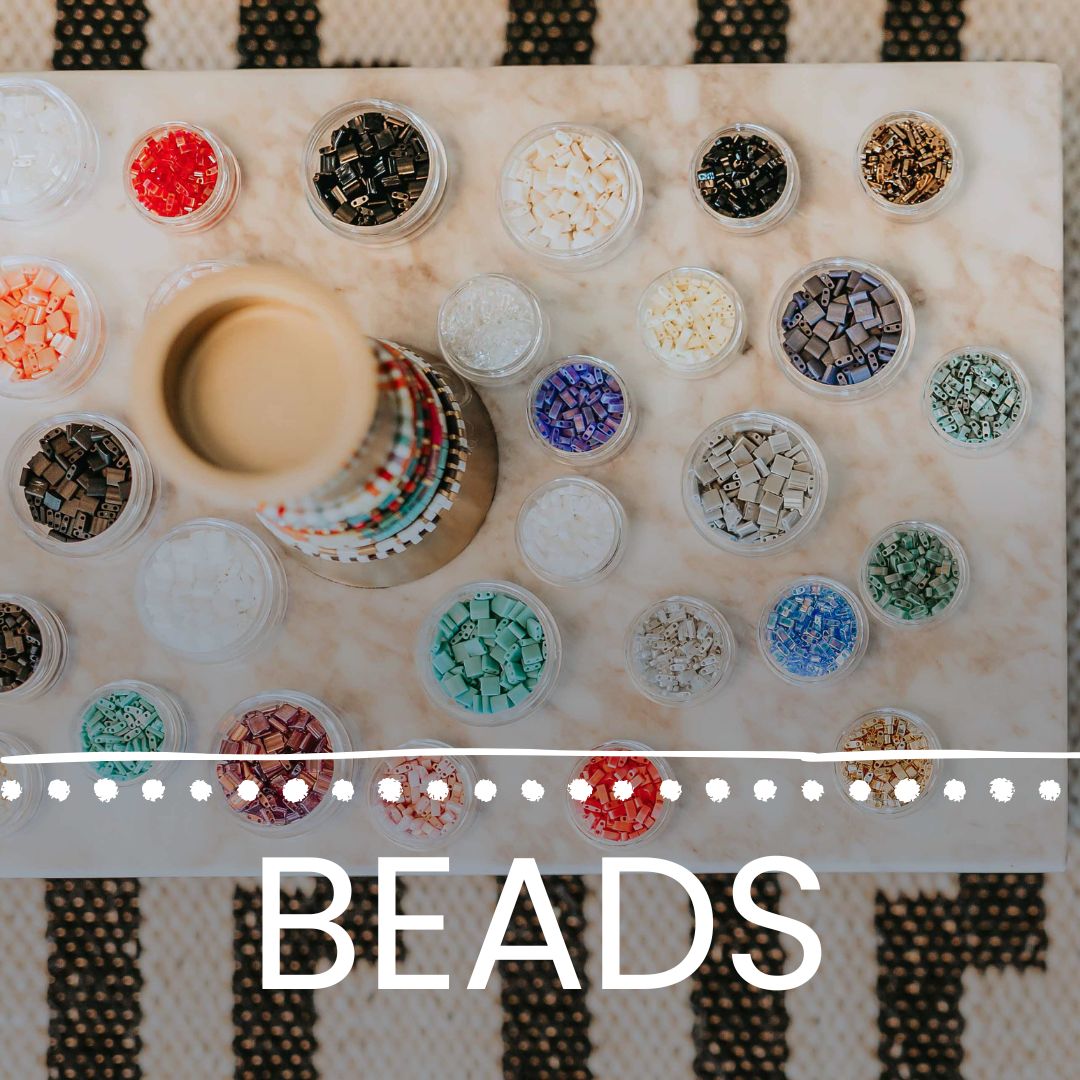
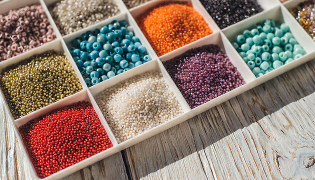
That's the short version. Rocaille beads (the small, round glass seed beads most people picture when they hear "seed bead") come in hundreds of color and finish combinations, which is exactly why so many first bracelets end up looking scattered. Below is a practical breakdown of the pairings, finishes, and seasonal palettes that hold together on a wrist rather than fighting each other.
Why Does Finish Change a Rocaille Color Combination?
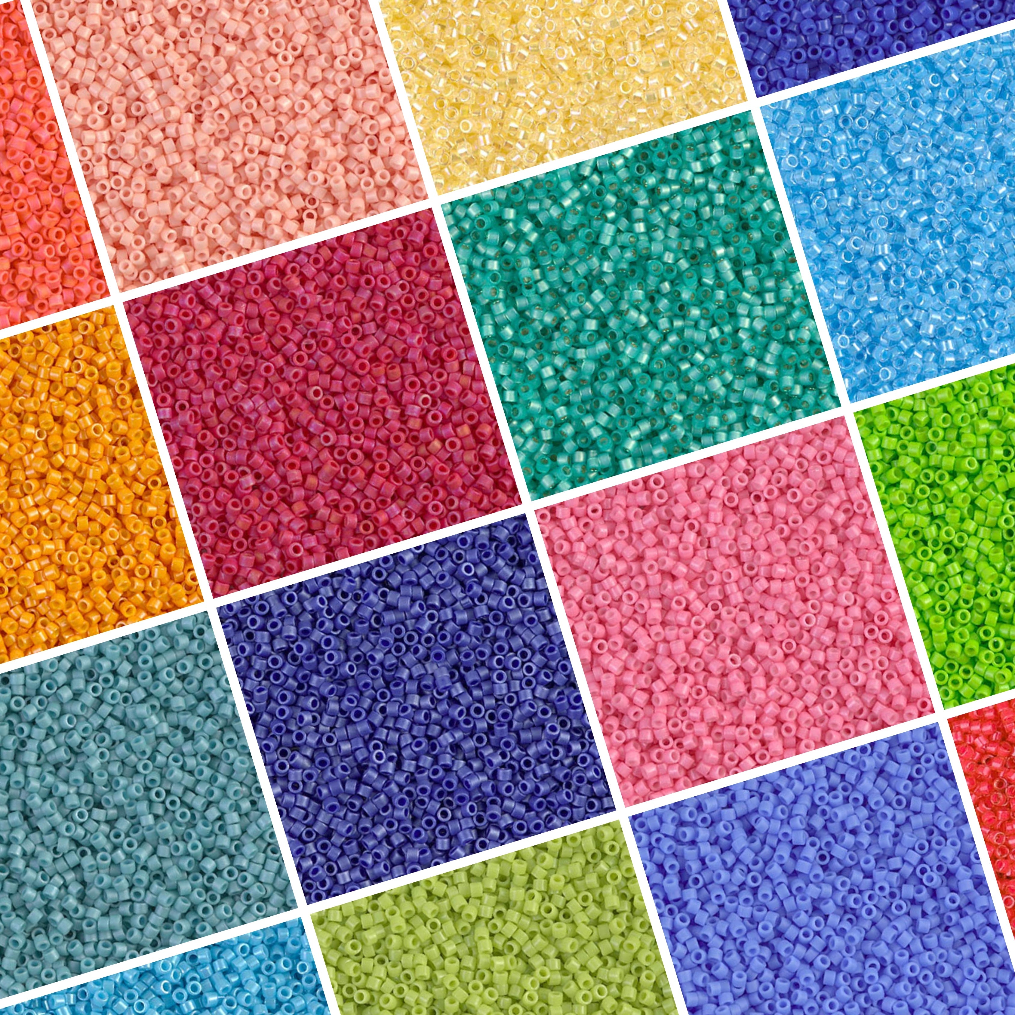
Finish decides how much a color actually shows up on the wrist. The same navy rocaille reads as bold and glassy in a transparent finish, soft and dusty in matte, and sparkly in silver-lined, so two bracelets in "identical" colors can look nothing alike once finish enters the picture.
Four finishes cover most rocaille color decisions. Matte is frosted and light-absorbing; it makes bright colors feel calmer and more wearable day to day. Silver-lined has a foil lining inside the hole that throws light back through the glass, so colors look brighter and glassier. Opaque is solid, flat color with no transparency at all, the most predictable finish and the easiest to color-match. AB (aurora borealis) adds an iridescent coating that shifts color slightly depending on the angle and the light source.
Mixing finishes inside one color combination is what makes a bracelet look designed rather than assembled. A single color in three finishes will always look more finished than three colors in one finish. Fire Mountain Gems' bead education library has a broader rundown of glass bead finish types if you want to see the full range beyond the four covered here.
Silver-Lined vs. Matte: Which Should Anchor Your Palette?
Matte anchors. Silver-lined accents. That's the short version.
A palette built mostly from matte rocailles sits quietly on the wrist and won't compete with a busier outfit. Add one run of silver-lined beads in the same color family and the bracelet gets a hit of shine without losing the calm base. Flip that ratio (mostly silver-lined with a little matte) and the bracelet reads as more formal and glassy, better suited to an evening piece than an everyday stack.
What Color-Theory Pairings Actually Work for Rocaille Beads?
Three classic color-theory approaches translate cleanly to a small bracelet surface: monochromatic, analogous, and a neutral-plus-accent version of complementary pairing.
Monochromatic uses one hue in multiple values and finishes. Think three shades of blue, from a pale sky matte to a deep cobalt opaque, tied together with a silver-lined mid-tone. It's the easiest palette to get right because there's no color-matching to second-guess.
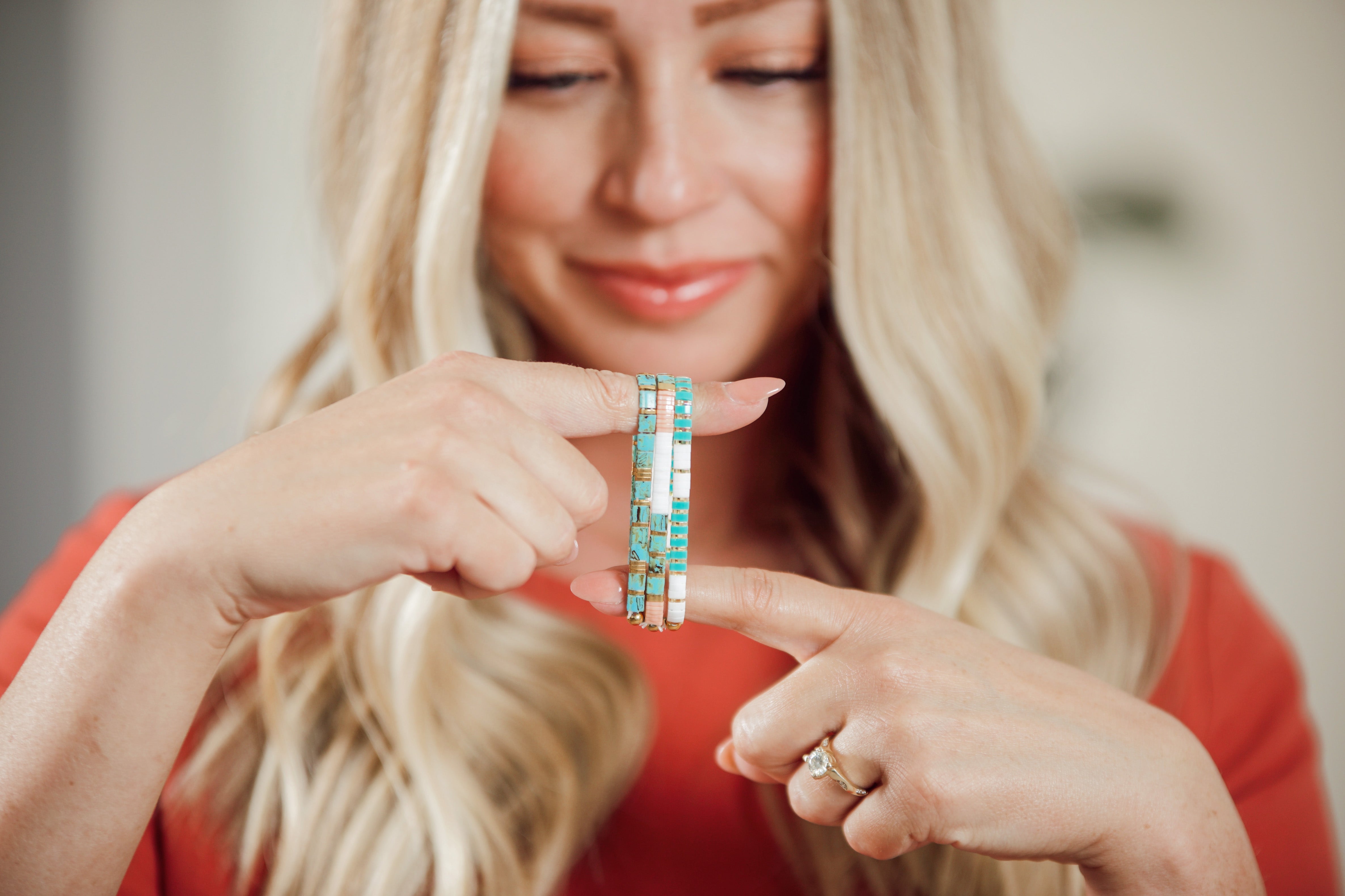
Analogous pulls two or three colors that sit next to each other on the color wheel, like turquoise, teal, and seafoam, or coral, peach, and warm yellow. These combinations feel cohesive because the colors share an undertone, even though they're technically different hues.
Neutral-plus-accent is the most forgiving version of a complementary pairing. Pick a neutral (matte white, greige, or black) as roughly 70 percent of the bracelet, then add a single saturated accent color as the remaining 30 percent. It reads as intentional rather than clashing because the neutral does the heavy lifting. The Wikipedia entry on color schemes walks through the mechanics of monochromatic, analogous, and complementary pairings if you want the underlying theory.
What doesn't tend to work: two or more high-saturation colors of roughly equal weight with no neutral to break them up. It's not impossible, but it takes a steadier eye than most first attempts.
What Palette Works Best for a Neutral, Everyday Stack?
Neutrals are the easiest palette to wear and the hardest to get wrong.
A dependable everyday rocaille palette: matte black, matte ivory, and one metallic-toned silver-lined gray. Three colors, three finishes, nothing to clash with jeans, a work outfit, or gym clothes. Neutral rocaille shades in particular tend to be the hardest colors to track down in a matched set, which is part of why they're worth stocking up on when you find a good source.
For a warmer neutral base, swap the gray for a bronze or gold silver-lined tone and add a matte tan or greige. Earth tones (rust, camel, sage) behave the same way as true neutrals in a rocaille stack because they pick up whatever undertone is already in the room.
What Seasonal Rocaille Palettes Should You Try?
Seasonal color pulls keep a bracelet rotation feeling current without buying an entirely new set of beads.
Summer: turquoise, coral, and warm white, mostly opaque and silver-lined finishes to catch the sun. Fall: burnt orange, deep olive, and a matte brown or bronze, muted tones that echo what most wardrobes shift toward in September. Winter: deep red, forest green, and gold, with AB and silver-lined finishes doing more visual work under low indoor light. Spring: lavender, soft peach, and sky blue, mostly matte with a touch of silver-lined shimmer.
Mack & Rex's own seasonal bracelet drops follow the same logic season over season, sun-faded brights in the warmer months, deeper jewel tones heading into the holidays, so it's a reasonable place to check what a finished palette looks like before you commit to buying loose beads in a color you're unsure about. Interweave's beading section is a good general reference if you want more seasonal palette ideas from the wider craft world.
How Do You Build a Cohesive Rocaille Color Palette, Step by Step?
Five steps, in order.
1. Pick one anchor color. A neutral or a color you already wear often works best, since it sets the tone for everything you add after it.
2. Choose a color-theory pairing. Decide up front whether you're going monochromatic, analogous, or neutral-plus-accent. Picking the structure before you pick individual beads saves a lot of second-guessing at the bead tray.
3. Vary the finish. Once the colors are set, split them across matte, silver-lined, opaque, or AB so the palette has depth rather than sitting flat.
4. Cap it at three colors. Including the anchor, three is the ceiling for most single bracelets. A stack of several bracelets can push past that, but each individual piece should stay simple.
5. Test it in daylight. Silver-lined and AB finishes in particular shift a lot between a craft table lamp and a window. Hold the beads or the finished bracelet up to natural light before you decide it's done.
How Do Rocaille Beads Pair with Tila Beads for More Depth?
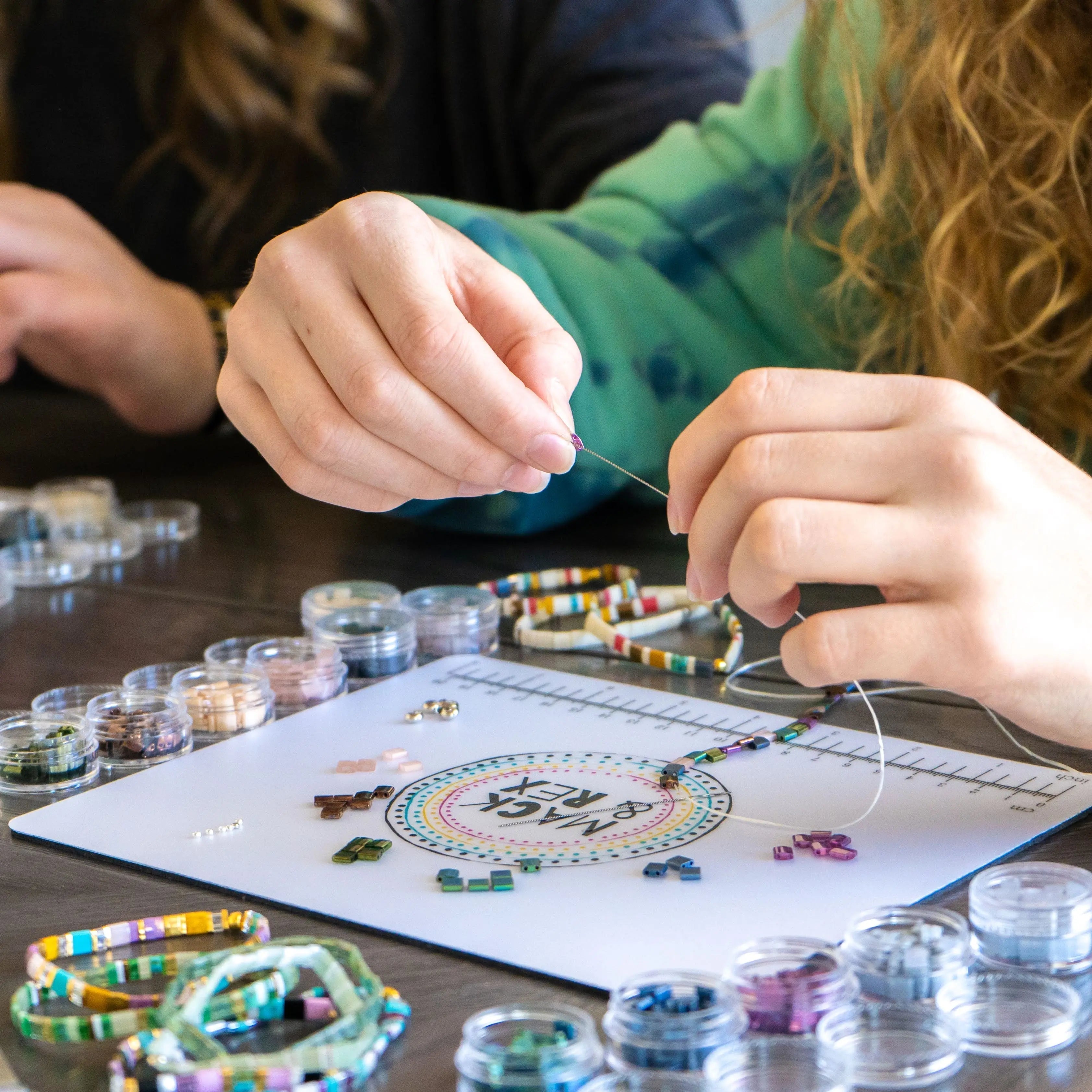
Rocaille beads and Miyuki flat Tila beads have different shapes, round versus flat and square, and that contrast is exactly what makes them work well together in the same bracelet or stack.
The simplest approach: pick your Tila bracelet's dominant color first, then choose rocaille beads in that same color but a different finish. A matte white and gold Tila bracelet pairs naturally with a silver-lined gold rocaille bracelet next to it. The color repeats, but the shape and shine don't, so the stack reads as coordinated rather than matchy. For a deeper look at what rocaille beads are, how their sizing works, and how they compare to Tila and other seed bead shapes, the Mack & Rex guide to rocaille beads covers the basics in more detail.
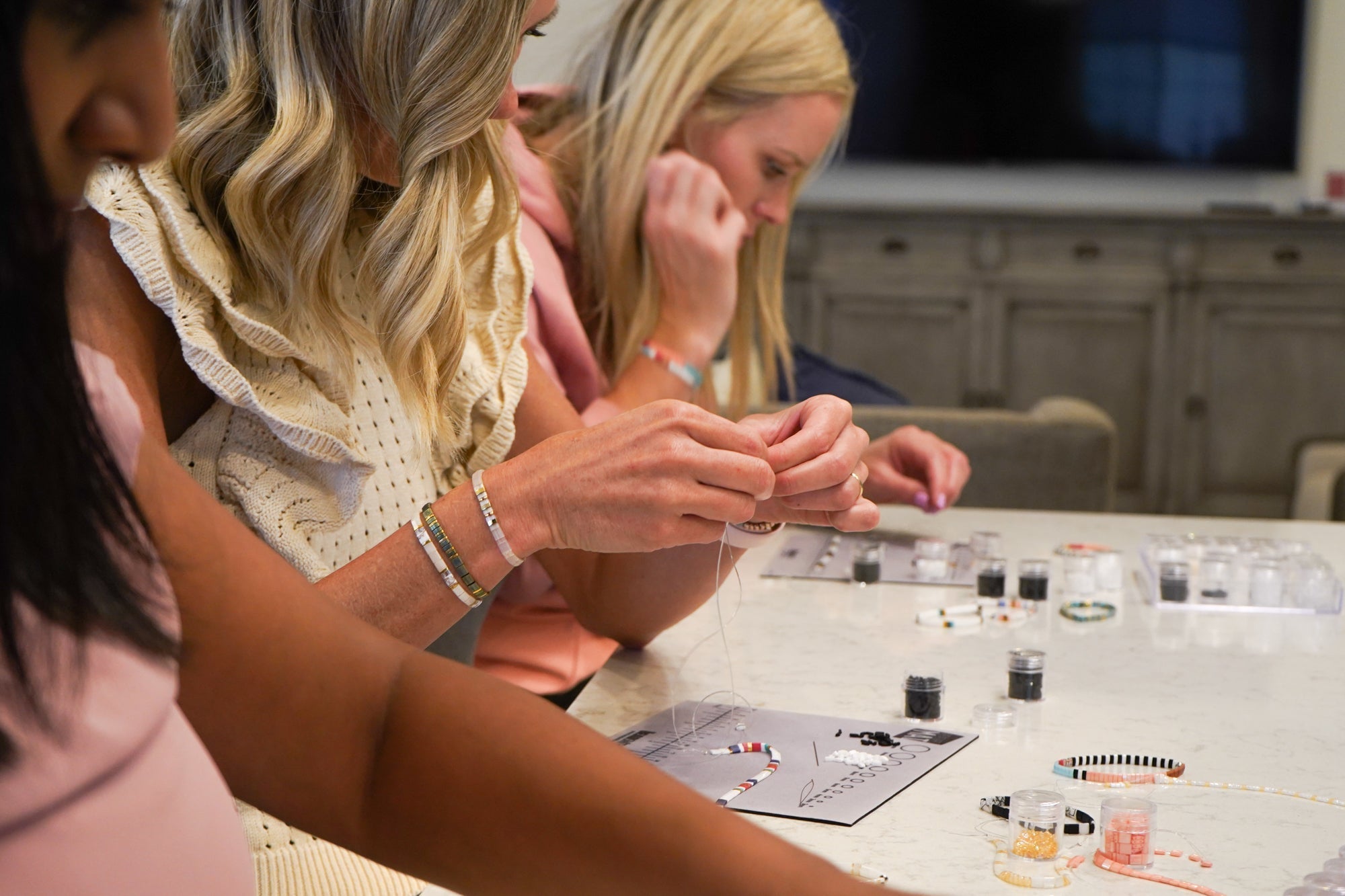
If kids are part of the bracelet-making session, keep loose beads in a sealed container between uses. Rocailles and other small beads are a choking hazard, so any project with young children needs an adult supervising the loose-bead stage.
Ready to Build Your Palette?
The fastest way to test a rocaille color combination is to buy a small amount in two or three finishes and lay them out before committing to a full bracelet. Browse the Mack & Rex seed bead collection to shop rocailles by color and finish alongside the Miyuki Tila beads they're often paired with. Orders over $100 ship free within the US, and buying three finished bracelets gets you a fourth free, no code needed, if you'd rather start from a ready-made palette and build loose beads around it.
Rocaille Bead Color Combinations: Frequently Asked Questions
What are the best rocaille bead color combinations for a bracelet?
The most reliable combinations follow basic color theory: monochromatic (one color in several finishes), analogous (two or three neighboring colors, like teal, turquoise, and seafoam), or a neutral anchor with a single bold accent. Sticking to two or three colors and varying the finish keeps the palette from looking random.
How many colors should a rocaille bead palette have?
Two or three colors is the sweet spot for a single bracelet or a small stack. One color reads as flat, and four or more competing colors on a bracelet this size usually looks cluttered rather than intentional. If you want more variety, add it through finish rather than a fourth color.
Does finish matter as much as color when pairing rocaille beads?
Yes. The same color in matte, silver-lined, opaque, and AB finishes can look like four different colors once light hits it. Finish is often what makes two bracelets in the same color family look coordinated rather than identical, so pay it as much attention as the color choice itself.
Can rocaille beads be paired with Tila beads in the same bracelet?
Yes. Rocaille beads are commonly used as spacers or accent beads alongside Miyuki flat Tila beads. Pull one color from the Tila piece and use rocailles in that same color, in a different finish, to tie the two bead shapes together without repeating the exact look.
What is the easiest rocaille bead color combination for beginners?
A monochromatic palette is the easiest starting point: pick one color and buy it in two or three finishes, such as matte, silver-lined, and opaque. There is no color-matching guesswork involved, and the finish contrast alone is usually enough to make the bracelet look put together.