

How to Choose Tila Bracelet Colors for Your Skin Tone
What tila bracelet colors work best for my skin tone?
The honest answer is that it depends on your undertone, not a fixed rule for anyone's skin tone. Warm undertones generally pair well with amber, olive, and gold-toned tila beads, cool undertones pair well with sapphire, fuchsia, and silver tones, and neutral undertones can wear almost anything. This is a starting point for choosing colors you'll actually want to wear, not a requirement.
Color matching for jewelry has been studied and written about for decades in fashion and design circles, going back to seasonal color analysis systems developed in the 20th century (Wikipedia: Color analysis). The short version that's useful for bracelet shopping: figure out your undertone first, then use it as a loose guide, not a hard rule.
How do I figure out my undertone before picking tila bracelet colors?
You don't need a professional consultation. A few quick, low-effort checks at home give you a solid enough read to shop with confidence.
Step 1: Look at your wrist veins in daylight
Step outside or stand near a window and look at the inside of your wrist. Green-looking veins usually point to a warm undertone. Blue or purple-looking veins usually point to a cool undertone. Both, or genuinely unclear? You're likely neutral, which is common and gives you the widest range of options.
Step 2: Notice which metal you already reach for
Think about your jewelry box. Do you wear gold-tone pieces more, or silver? People with warm undertones often gravitate toward gold and gold-finished tila beads. People with cool undertones often gravitate toward silver and cooler bead finishes. It's a small thing, but it's real-world evidence you've already been collecting for years.
Step 3: Think about how your skin tans
Skin that tans easily and rarely burns tends to lean warm. Skin that burns before it tans, or stays pink in the sun, tends to lean cool. This isn't universal, but it's a useful data point alongside the vein check and the metal preference.
Step 4: Hold actual beads against your skin
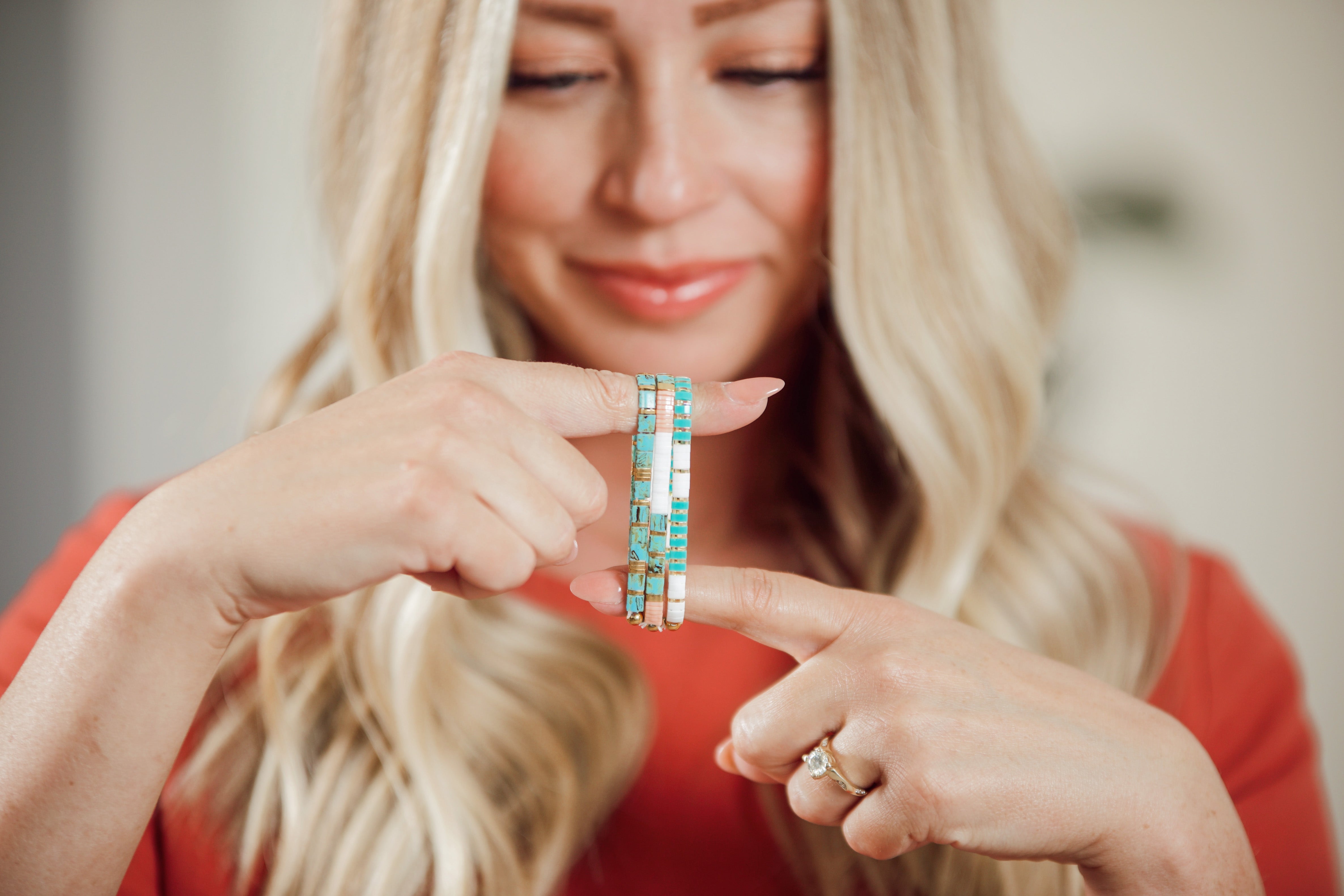
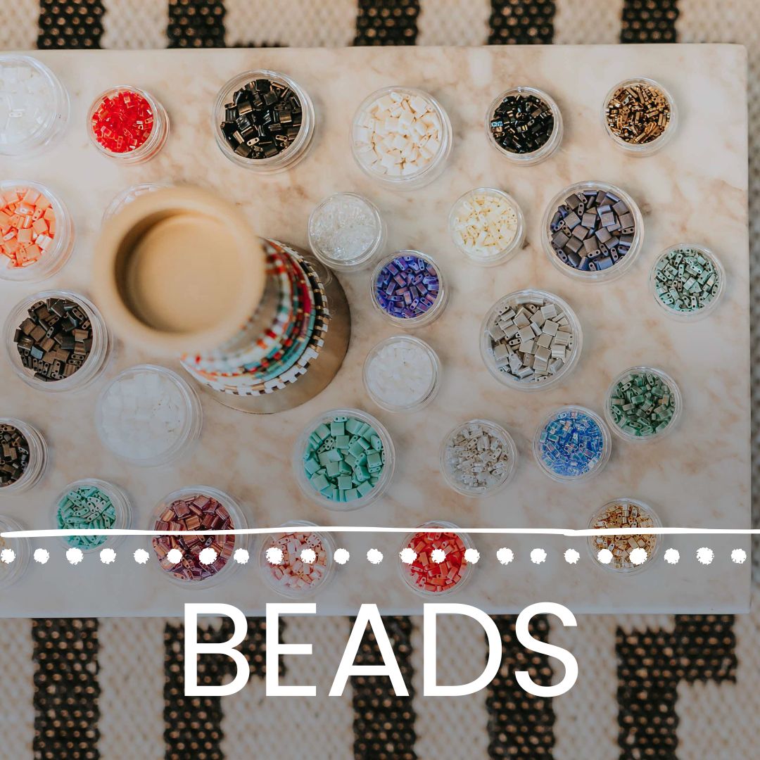
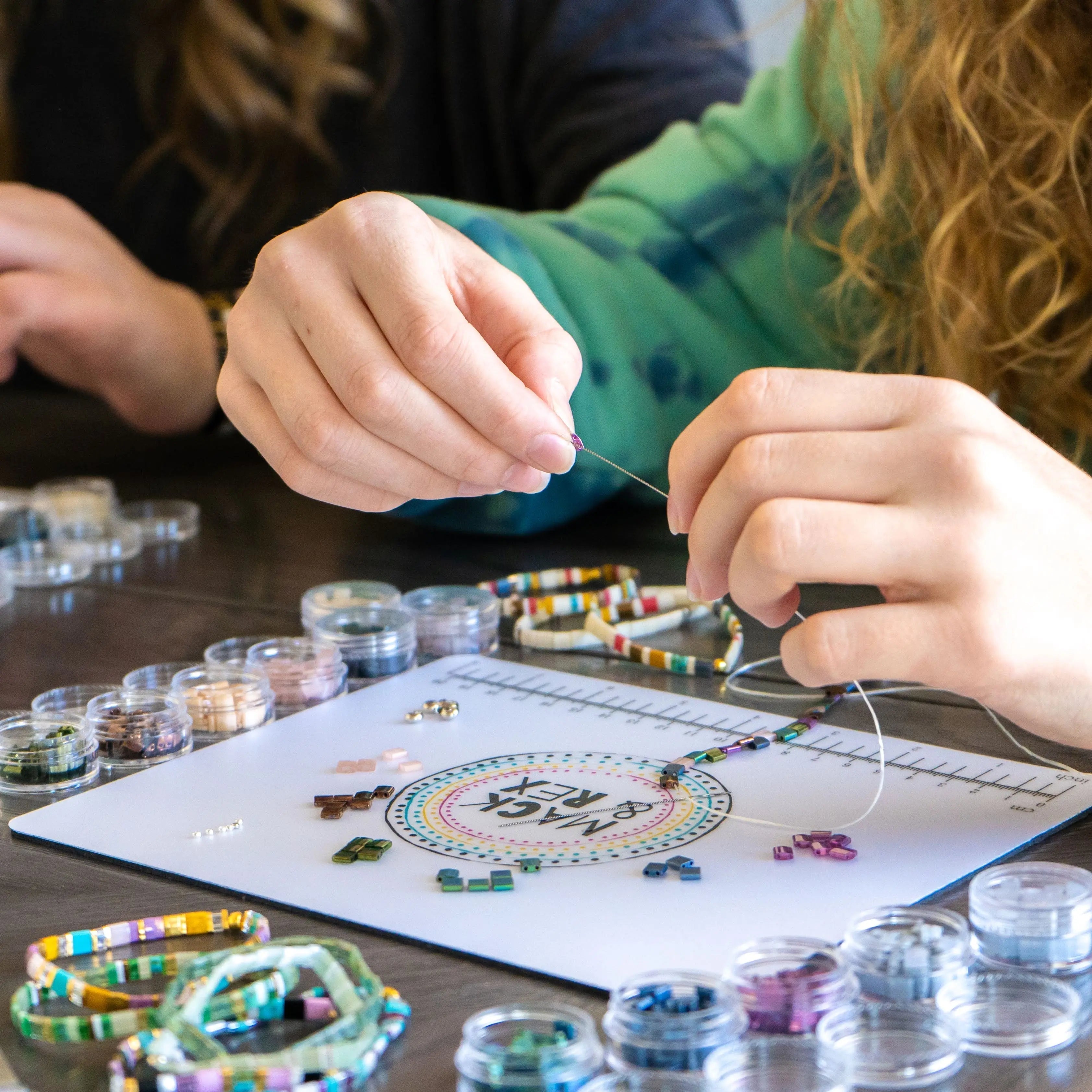
Here's the part that matters most: none of the theory above beats five minutes with real beads. Hold a small tila bead mix against the inside of your wrist in daylight. If a color makes your skin look brighter and more even, that's a good sign. If it makes your skin look washed out or dull, set it aside. This is the same basic principle jewelers and stylists use when helping someone choose metals and stones (Wikipedia: Warm and cool colors), applied directly to beadwork.
What tila bracelet colors suit a warm undertone?
Warm undertones tend to look great in earthy, sun-touched colors. Amber, olive, warm coral, bronze, and gold-finished tila beads are common favorites. Mack & Rex's RETRO SUNSET collection leans into exactly this kind of warm, sun-washed palette, and it's a fast way to grab a bracelet that's already color-coordinated rather than building a stack bead by bead.
If you want variety within warm tones, look at bead mixes that combine two or three warm shades rather than a single flat color. A bracelet that mixes amber and bronze tila beads, for example, reads richer on the wrist than one solid tone, and it plays well against tanned or deeper warm skin.
What tila bracelet colors suit a cool undertone?
Cool undertones generally do well with jewel tones and true, clear colors: sapphire blue, fuchsia, true red, icy lavender, and silver-finished beads. The STAINED collection's deeper jewel-tone mix and the EVERGREEN EDIT's cool greens both fit this range and give you a coordinated bracelet without needing to hand-pick individual bead colors.
A quick fragment worth remembering: cool tones photograph clean. Sapphire and fuchsia tila beads tend to hold their color well in photos, which matters if you're picking a bracelet for a wedding, a family photo day, or another event where pictures matter.
What if I have a neutral undertone, or I just want the flexibility?
Neutral undertones have the easiest job here. You can wear warm ambers and cool sapphires equally well, so the deciding factor becomes personal preference and occasion rather than color science. Soft matte metallics, dusty teal, and muted plum tend to be safe, flattering middle-ground choices for neutral undertones and for anyone who'd rather not overthink it.
This is also where mixing comes in. You don't have to commit to one undertone family for your whole stack. Plenty of Mack & Rex customers wear a warm-toned bracelet from RETRO SUNSET on one wrist and a cool-toned piece from STAINED on the other, using a neutral tone, like a soft gray or cream, to bridge the two if they're stacking on the same arm.
Do I need to match my bracelet color to my outfit too?
Skin tone is the bigger factor for whether a color flatters you, but outfit color still matters for how coordinated the whole look feels. A useful shortcut: pick your undertone-friendly color family first, then choose the specific shade within that family based on what's in your closet most often.
If most of your wardrobe is neutral, black, white, denim, tan, almost any undertone-matched tila color will work with it. If you wear a lot of one bold color already, look for a tila bracelet shade that complements it rather than competes with it. Craft and design educators have written at length about pairing color families for exactly this kind of everyday styling decision (Fire Mountain Gems: Encyclobeadia), and the same logic applies whether you're stringing your own beads or picking a finished piece.
Where should I start if I don't want to overthink it?
Start with a named collection that already leans warm or cool, and let it do the color-matching work for you. That's the fastest path if you'd rather spend your time wearing the bracelet than researching it.
- Warm undertone: RETRO SUNSET (amber, coral, gold-finished tones)
- Cool undertone: STAINED (jewel-tone blues, purples, deep reds) or EVERGREEN EDIT (cool greens)
- Neutral undertone or beach-casual: BEACHY (soft, sun-faded neutrals and pastels)
All of Mack & Rex's finished tila bracelets use the same crystal-cord elastic and inclusive sizing from XXS to 5XL, so once you've picked a color family, fit isn't something you have to think about separately.
Browse the full Mack & Rex tila bracelets collection to see the current color drops across all four named collections and pick the palette that fits your undertone.
Frequently asked questions
Is there one tila bracelet color that looks good on everyone?
Not one single color, but certain finishes come close. Soft matte metallics and mid-tone jewel colors like a dusty teal or muted plum tend to sit well with a wide range of undertones because they're not aggressively warm or cool.
What tila bracelet colors work well for a warm undertone?
Amber, olive, coral, warm bronze, and gold-finished tila beads tend to work well with warm undertones. RETRO SUNSET leans into this palette with its warm, sun-washed color mix.
What tila bracelet colors work well for a cool undertone?
Sapphire blue, fuchsia, true red, silver, and icy lavender tila beads tend to work well with cool undertones. STAINED's deeper jewel tones and EVERGREEN EDIT's cool greens are both good starting points.
How do I know if my undertone is neutral?
If your wrist veins look both green and blue, and you wear gold and silver jewelry equally well, you likely have a neutral undertone. Neutral undertones generally have the most flexibility and can wear both warm and cool tila bracelet colors.
Can I mix warm and cool tila bracelet colors in one stack?
Yes. A bracelet stack doesn't need to match one undertone rule. Many customers mix a warm-toned bracelet with a cool-toned one and let a neutral piece, like a matte cream or soft gray, bridge the two.
Ready to shop by color instead of guessing? Head to the Mack & Rex tila bracelets collection and filter by the palette that matches your undertone. Buy 3 bracelets and get 1 free, no code needed, and orders over $100 ship free within the US.