

Beaded Bracelet Kit for Beginners: How to Choose Your First Color Palette
What's the First Thing to Do When You Open a Beaded Bracelet Kit?
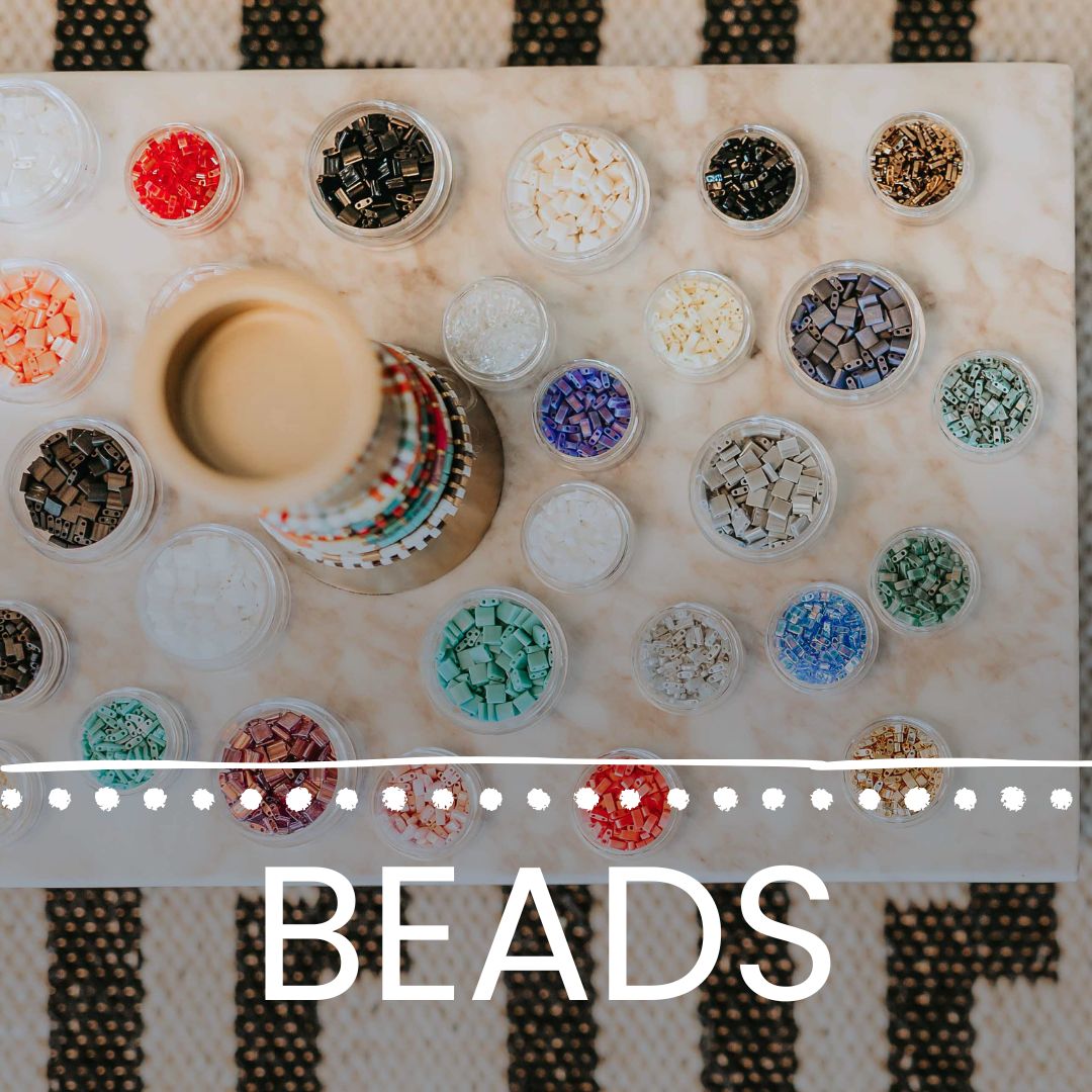
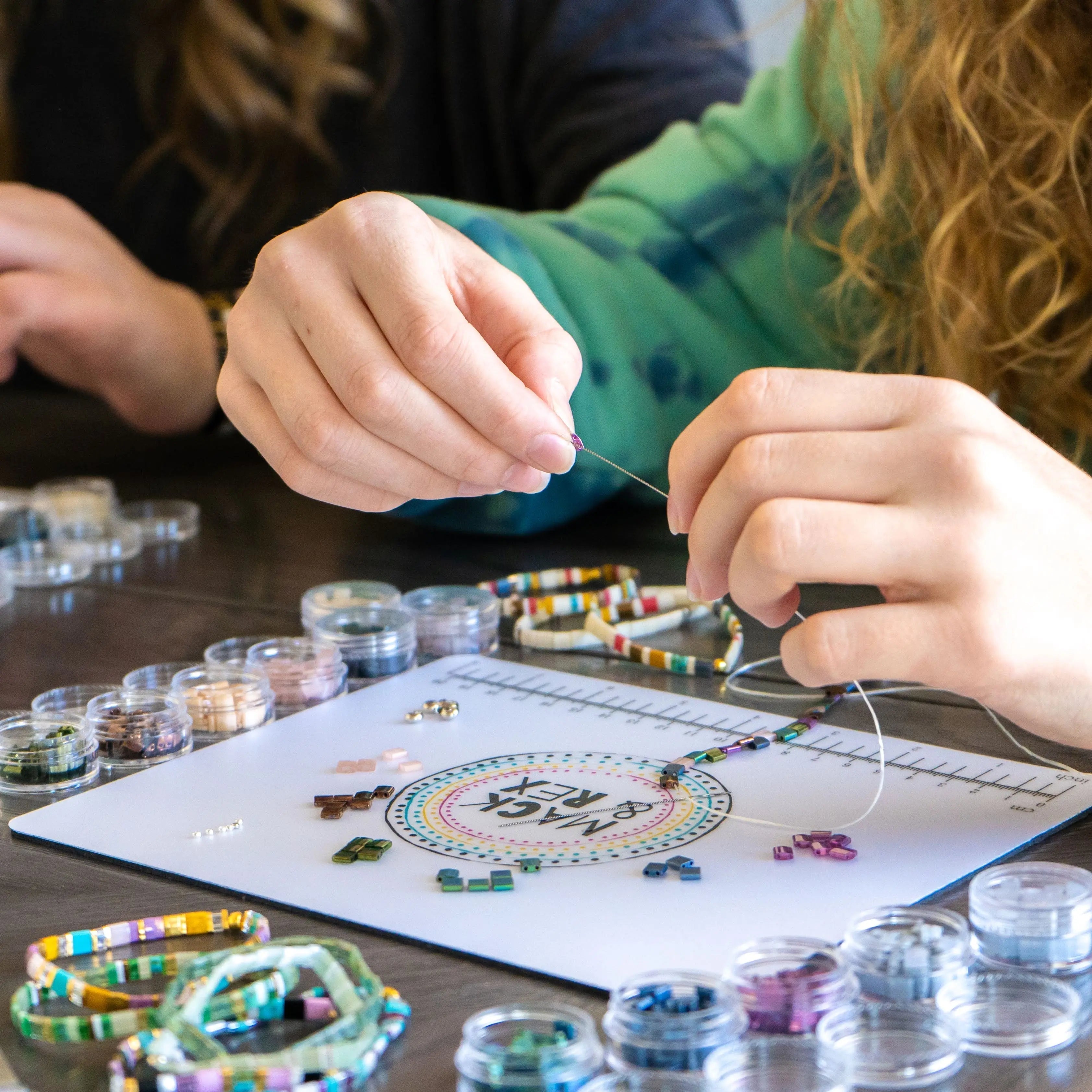
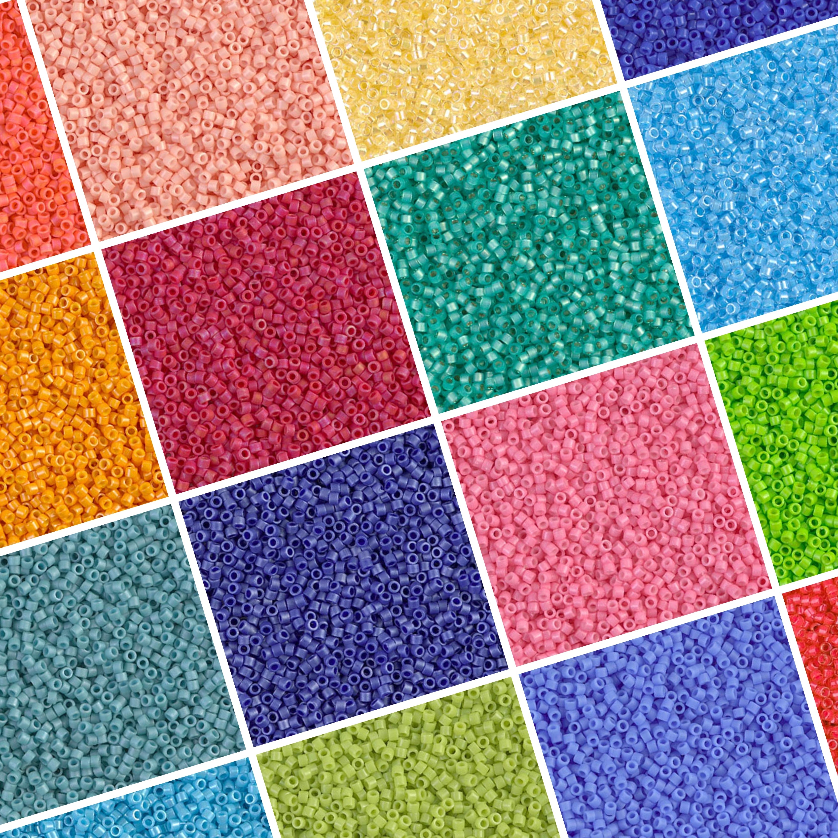
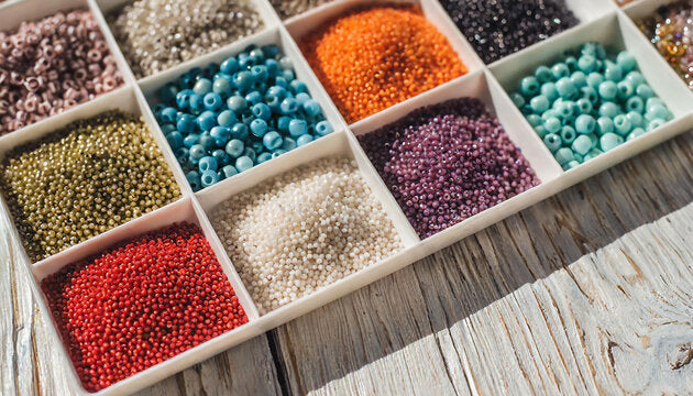
Sort your beads by color family before you string a single one. Most beginners dump every strand onto the table and start grabbing whatever catches their eye, and that's exactly how you end up with a bracelet that looks random rather than planned.
A beaded bracelet kit usually hands you more color than you need for one bracelet, on purpose, so you can make several bracelets from one box and save what you skip today for next week's project. Take five minutes to lay your beads out by family (neutrals, blues, pinks, greens, whatever your kit includes) before deciding what goes on your wrist first.
Why Should Every Palette Start With a Neutral Base?
A neutral base is the color that shows up in nearly every bracelet you make, and it's what keeps a full stack looking like one collection, not five unrelated pieces. Black, white, gray, tan, and warm bone tones all work as a base because they don't fight with anything else in the kit.
Think of your neutral the way you'd think of a white t-shirt in your closet: not the piece people notice first, but the piece that makes every other piece work. If your kit came with bright, saturated Tila colors, look for the quietest one in the group, usually a matte gray, a soft cream, or a black with a subtle finish. Skipping this step is the single biggest reason first bracelets feel busy rather than finished.
How Do You Pick an Accent Color That Actually Works?
Choose one accent color, not three or four favorites at once. An accent is the color that does the talking on a bracelet, and it only works if the rest of the piece stays quiet enough to let it.
Colors sitting directly across from each other on the color wheel (blue and orange, red and green, purple and yellow) create the highest contrast and read as bold, eye-catching pairings. Colors sitting next to each other blend more softly and feel calmer on the wrist. Fire Mountain Gems' guide to color in jewelry design covers this same split, and it holds true for glass Tila beads too. On a first kit, start with an analogous pairing (colors next to each other); it's more forgiving while you're still learning how the colors sit against your skin.
How Do You Match a Color Palette to Your Skin Tone?
Hold a few bead strands up to your bare wrist in daylight, not under a lamp or a phone flashlight, and watch which ones look warm and flattering versus flat and washed out. Indoor lighting shifts color more than people expect; a shade that looked great under a kitchen light can read totally different by a window.
Undertone matters more than skin depth here. Veins reading more green usually mean a warm lean, where gold-adjacent tones, coral, rust, and olive sit well against the wrist. Veins reading more blue or purple usually mean a cool lean, where silver-adjacent tones, jewel blues, and true pink work better. Brilliant Earth's guide on choosing jewelry colors for skin tone breaks this down further. Neither undertone is better for beading; it's just information that saves you from picking a color you'll never reach for.
How Do You Match Your Palette to Your Wardrobe?
Pull colors from what you actually wear on a normal Tuesday, not one outfit you love but rarely put on. A bracelet stack gets worn constantly, so it needs to work with your daily rotation, not a single statement piece in the back of your closet. Denim, white, black, and olive closets do well with a warm neutral base and a rust or mustard accent; coastal closets, soft blues and sandy tans, do well with a coral accent. This isn't about matching every outfit exactly. It's about picking a palette that doesn't clash with the colors you already reach for most.
How Many Colors Should Be in Your First Palette, and How Do You Build a Cohesive Stack?
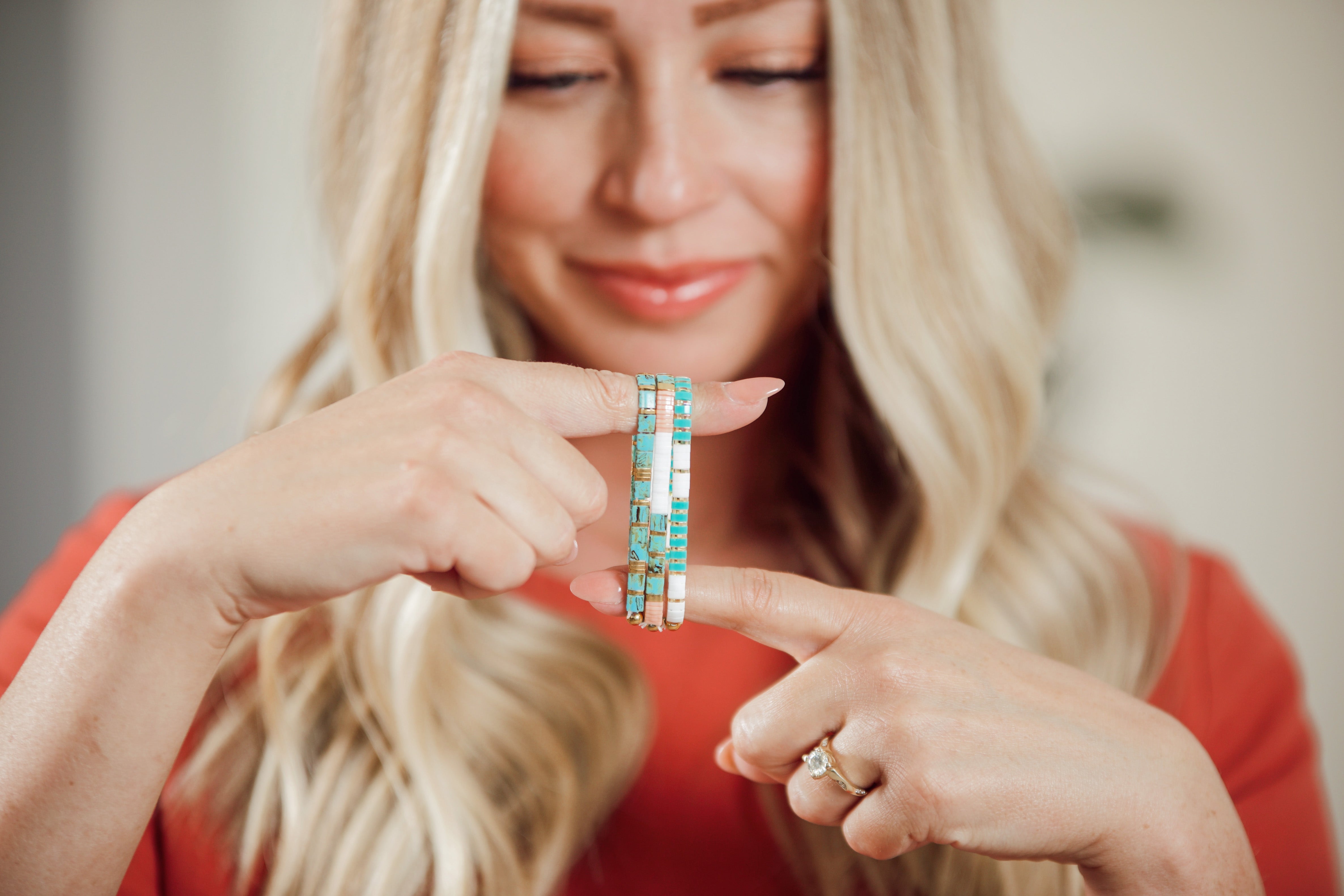
Two to four colors, total: one neutral base, one main accent, and one or two small supporting pops. A kit with a big color range tempts you to use everything at once, but a single bracelet showing off ten colors reads as cluttered rather than intentional. Save the rest for the next bracelet in the stack; working from something like the $44.99 trio kit already gives you three bracelets' worth of beads to spread your range across.
Use a rough ratio across your bracelets: about 60 percent neutral, 30 percent accent, and 10 percent a small pop of a third color. Applied across three or four bracelets rather than one, this ratio is what makes a stack look designed, not assembled piece by piece.
Bracelet one is mostly neutral with a thin band of the accent. Bracelet two flips the ratio, more accent, less neutral. Bracelet three brings in the small pop color as its main event, with the neutral still holding it together. Worn as a set, the three share a clear family resemblance even though no two are identical. For more pairing options once you've got the base-and-accent method down, our guide on Tila bead color combinations walks through several more.
What Are the Most Common Color Mistakes Beginners Make?
The top mistake is skipping the neutral base entirely and going straight to three bold colors on one bracelet. Without something quiet to anchor it, even beautiful colors compete for attention and the whole piece looks busier than intended. The second mistake is choosing colors under bad lighting, usually overhead fluorescent light at a craft table, then being surprised when the finished bracelet looks different in daylight.
The third is ignoring finish: a matte teal and a shiny metallic teal are technically the "same" color, but one reads dull and one reads bold, and pairing them without noticing leaves a bracelet looking unfinished. Our post on how to mix and match Tila bead bracelet colors goes deeper on finish pairing.
What If You're Still Not Sure Which Colors to Pick?
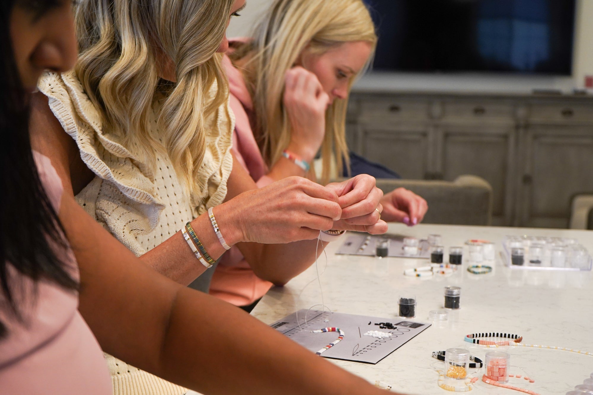
Default to a base-plus-one system and you genuinely cannot go far wrong. Pick your quietest neutral, pick one color you already love wearing in clothing, and make your first bracelet with just those two. I started my own daughters on exactly this system at our kitchen table; fewer color decisions up front meant they finished bracelets they actually wanted to wear, instead of getting overwhelmed by a full bead tray and never picking up the cord. That's the whole point of a good starter palette: it should make the decision easier, not harder.
A Quick Safety Note
Beaded bracelet kits involve small parts and are a choking hazard, so keep loose beads away from children under three and have an adult at the table any time kids are crafting.
Where to Get Your First Beaded Bracelet Kit
Mack & Rex's bracelet making kits collection includes options built around genuine Miyuki Tila glass beads, from smaller trio kits for a single afternoon project up to bigger multi-bracelet sets for a full stack. Mack & Rex resells authentic Miyuki product rather than manufacturing it, so what's in your kit is the real thing.
Mack & Rex ships internationally, with shipping and any customs or duties calculated at checkout, and US orders over $100 ship free. A single kit on its own may not clear that $100 line, so check your cart total if free shipping matters to your order.
FAQ: Choosing Your First Beaded Bracelet Kit Color Palette
How many colors should be in my first beaded bracelet kit palette?
Two to four colors total works best for a first palette: one neutral base, one main accent, and one or two small supporting pops. Kits with dozens of loose colors tempt beginners to use all of them at once, which is the fastest way to end up with a stack that looks cluttered rather than intentional.
How do I match my bracelet kit colors to my skin tone?
Hold a few bead strands against your wrist in natural daylight rather than under indoor lighting, which can shift how a color reads. Warm undertones generally look best in gold-adjacent, coral, rust, and olive tones, while cool undertones lean toward silver-adjacent, jewel-toned blues, and true pinks.
What's the biggest color mistake beginners make with a beaded bracelet kit?
Using every color in the kit on the first bracelet. A kit is built to give you options across several bracelets, not one bracelet that tries to show off the whole palette. Pick a base and one accent per bracelet, then let variety show up across the stack, not within a single piece.
Should my beaded bracelet colors match my wardrobe exactly?
Not exactly, but they should not clash with what you wear most either. Pull colors from your everyday rotation rather than a single statement outfit, since a bracelet stack gets worn far more often than any one piece of clothing gets repeated.
Can I change my color palette after I finish my first bracelet kit?
Yes. Your first kit is a starting point, not a permanent decision. Once you see your base-and-accent combination on your actual wrist, it's normal to adjust the ratio or swap an accent color on your next kit or bead mix.
Sources for the color theory and skin tone notes above: Fire Mountain Gems' guide to color in jewelry design and Brilliant Earth's guide to choosing jewelry colors for your skin tone.
Ready to pick your first palette? Shop the full bracelet making kits collection at Mack & Rex. US orders over $100 ship free.